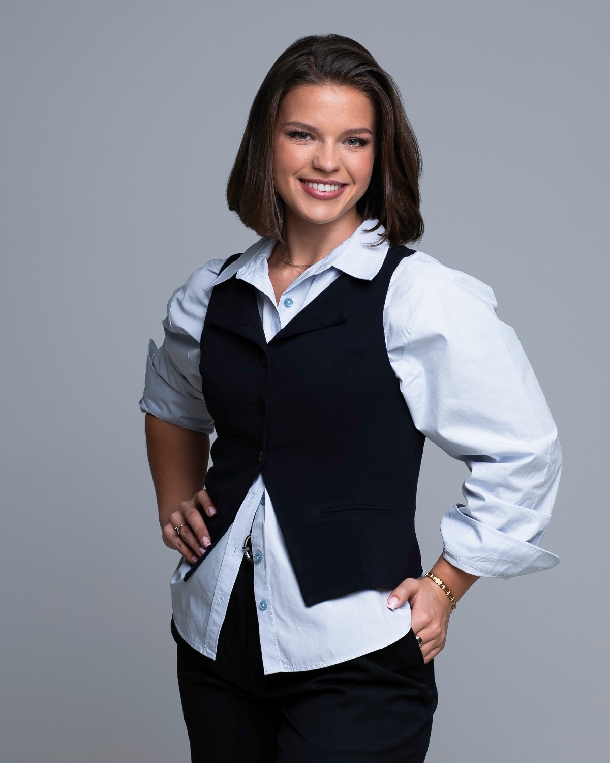
Most people book one portrait and then spend the next year trying to make it fit everywhere. Personal brand photography works the other way around. You decide where the images have to live, plan a set that covers those places, and shoot it in one sitting. This guide walks through how that planning actually works, start to finish.

Personal brand photography is a planned set of portraits and lifestyle images made for the specific places your business shows up: your website, your profiles, your posts, your press mentions and your pitch decks. A headshot is one photograph of your face, built to do one job well. A brand library is a range of looks, crops and backgrounds from a single planned sitting, so there is always an image that fits the channel and still looks like you.
The planning is the whole trick. Decide where the pictures are going first, then choose the looks that serve those places.
Think of it as portraiture with a job description. Every frame is made because something you own needs a picture in it: a homepage that currently has a stock photo, an About page with a paragraph and no face, a profile that has not changed in a while, a talk you are pitching, a newsletter that goes out with nothing to look at. That is what a personal brand session is for. Editorial portraits and lifestyle frames, planned around a business rather than around a mood.
It helps to say what it is not. It is not a day of pretty pictures you sort out afterward. It is not a mood board you hand to a photographer and hope for. And it is not a substitute for a good headshot, which has its own narrow job to do. In a well planned library, every image already has an address it is going to before the camera comes out. That is the difference between a folder of photographs and a set of assets you actually use.
A headshot is an introduction. It is tightly framed, it centers on your face and expression, and it is doing one thing: helping a stranger decide, in about a second, whether you look like someone worth calling. It lives on your profile, in a directory, in an email signature, on a conference badge. The LinkedIn profile photo is the clearest example of the type, and it has rules of its own.
You need both, and the useful way to hold it in your head is that the headshot is one item in the library, not a competing purchase. When you plan a brand sitting, put the tight portrait first, because it is the image with the most jobs. Everything else is built out from there.
The most common planning mistake is opening the closet first. Wardrobe is the last decision, not the first one. Start instead by listing the places an image has to go, because the place dictates the shape of the picture, and the shape dictates how it has to be shot. A tall vertical portrait cannot become a wide banner, no matter how good it is.
Write the list before you plan a single look. Then count the shapes: how many wide frames, how many verticals, how many squares. Most people are surprised by how few actual images they need, and by how badly one portrait covers a list like that. If your list is dominated by posting, the social media portraits session is built for exactly that, and it is a narrower plan than a full library. If it is dominated by pages, website and brand imagery is the closer fit.
A shot list is not a script. It is a short table that turns a vague ambition into a sitting. One row for each image you actually need, with four columns: where it goes, what shape it is, what you are wearing, and what you are doing in it. Ten honest rows is a real plan. A page of adjectives is not.
Homepage banner, wide horizontal, the sharpest look you own, seated and turned toward the light with space to the left. That is enough for me to light it, place you and shoot it. Now do that nine more times and you have a sitting that runs on rails instead of on hope. Rows also make the tradeoffs visible: if six of your ten rows need the same look and the same background, you have room for another look you had not planned.
This is also how a content day is built. The list comes first, then the order of the looks, then the backgrounds, so nothing gets improvised while you are standing there in good light. And the list is reusable. The next time you plan a sitting, you start from the last one, cross off what still works and write rows only for the gaps.
Most libraries are well served by three tiers, and almost nobody needs more than that. The most formal version of you, for the rooms where you want to look unmistakably credible. The everyday version, which is what you actually wear to meet a client. And a relaxed version, softer and warmer, for the places where people are deciding whether they like you as much as they respect you.
Keep the tiers honest. The formal look should be something you own and would genuinely wear, not a costume borrowed for the day, because pictures of people in clothes they are uncomfortable in read exactly that way. Solid colors hold up better than busy patterns across small crops. The specifics of fabric, neckline and color are their own subject, and what to wear covers them properly.
You do not have to settle any of this alone. We plan your looks together before the shoot, in a wardrobe consultation, and I will tell you plainly which pieces will photograph well and which ones will fight the camera. Several backgrounds and wardrobe changes fit inside one sitting, which is exactly what gives a library its range.
The column that stumps people is the one that asks what you are doing in the frame. Standing and smiling covers maybe three rows of a good list. The rest want you mid-something, because a page reads faster when the picture shows the work rather than just the person who does it. That does not require hunting down a dramatic setting. Most of it is built in a studio, and it usually comes out better there, because the light is controlled and the background is not arguing with your face.
There is an honest limit worth knowing before you plan. A studio is not going to pretend to be your actual place of business, and it should not try, because a faked setting reads as fake to exactly the people you are trying to win. What a studio does beautifully is isolate you and your work against a clean background, which is what most pages and profiles genuinely need. Plan the rows that benefit from that isolation, and let the ones that truly depend on a specific room stay off the list.
Sessions happen in my private studio in North Naples, off Pine Ridge Road. It is a quiet room, multiple backdrops, no audience, and an unhurried pace, which matters more than people expect. A brand sitting asks you to be several versions of yourself in a row, and that only works if you are relaxed enough to change gears.
You will never have to invent a pose. I guide you head to toe through every frame, so the part most people dread, standing there wondering what to do with your hands, simply does not happen. That guidance is what makes a varied library possible in one sitting: I can move you from the formal seated frame to the relaxed standing one without you having to figure out either.
Afterward your images are retouched by hand and delivered in a private, password protected gallery within the week, ready to download and hand to whoever manages your site. People drive in for this from all over Southwest Florida, Cape Coral included, because the plan travels better than the pictures do.
A library only pays off if the images get used, and the failure mode is predictable: the gallery arrives, three photos go up, and the rest sit in a folder. Beat that by doing the placement while the images are still exciting. Update every profile in one pass so they match. Send the whole set to whoever builds your pages, with a note about which row each image was shot for. Keep a small folder of the ones you will reach for most, so posting is a matter of choosing rather than searching.
Then space the rest out. The unused half of a library is what carries you through the months when nothing new is being made, and a picture nobody has seen yet is worth more than the one you have already posted twice.
What belongs on your list depends heavily on what you sell. A trainer needs frames that show motion and instruction, which is why the plan for fitness trainers looks nothing like the plan for coaches, who need warmth and eye contact above all. And if your company has several people who each need this, the sequencing and consistency questions are their own topic, covered in the guide to team headshots.
Libraries go stale in three ways, and none of them are about the calendar. Your look changes, and the pictures stop matching the person who walks into the meeting. Your offer changes, and the images are illustrating a business you no longer run. Or you have simply used them all, and your audience has seen every frame twice.
The honest test is to open your own site and your own profile as a stranger would. Does the person in the picture look like the person a client is about to meet, today, in the clothes you actually wear? If yes, the library is still working. If you hesitated, you already know.
Refreshing is easier than starting, which is the quiet advantage of having planned properly the first time. The shot list exists, the looks that worked are known, and you can rebuild the set faster than you built it. The second sitting is also easier to walk into, because you already know how the room feels and what is going to be asked of you.
Bring me your list of channels, even a messy one scribbled on the back of something, and I will tell you honestly what a single sitting can cover and what should wait for the next one. Planning and pricing are both personal, so the best next step is a quick call to (239) 319-6171, or send the form and I will reply myself.
Book a Session Call (239) 319-6171Tell me a little about what you have in mind and I will be in touch personally. Pricing is personal, so the best way to plan is a quick call.
Share a few details and Annie will be in touch personally.