Portfolio
Headshots Boudoir Personal Brand
More
Guides Investment Guided Posing About Book a Session
Home  /  Guides  /  LinkedIn Profile Photo Guide
Career

The LinkedIn profile photo, done properly.

Your profile photo is the smallest, hardest working image you own. It sits beside every message you send, every comment you leave and every search someone runs on your name. This guide covers only what is specific to that little circle: the crop, the background, the expression, the banner, and how often the whole thing needs replacing.

By Annie Watson · Naples, Florida · Updated September 2026
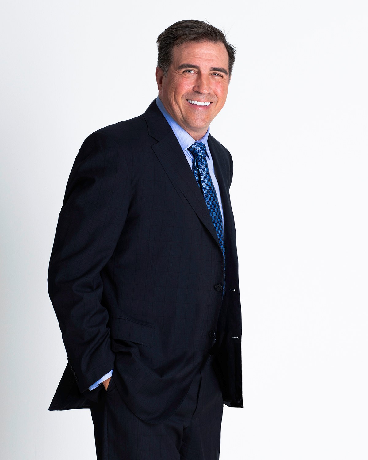
Man in a navy suit and patterned tie standing with hands in his pockets, white backdrop, photographed by Annie Watson in her Naples studio
The Short Answer

A LinkedIn profile photo should be a current, well lit photograph of your face, cropped so your head fills most of the circle, on a background with nothing in it competing for attention. Look at the lens, and let the expression be an easy one rather than a formal one.

The framing matters as much as the face. LinkedIn crops your image to a circle and displays it small, so a photo that works at full size can fail completely at thumbnail size. Judge yours at the size other people see it, not at the size you uploaded it.

The circle is the format, not the photo.

Almost every problem with a LinkedIn photo is a framing problem wearing a disguise. The platform does not show your picture. It shows a circle cut from the middle of your picture, at a size somewhere between a postage stamp and a coin, more often than not in a list of other people.

Two things follow from that. First, corners disappear. Whatever you placed neatly in the top left of your composition is simply gone. Second, distance kills. A photo taken from across a room, where your face is a small part of a large frame, becomes unreadable the moment it is squeezed into that circle, and the person scrolling past has no idea who they just skipped.

So crop close. Your head and shoulders should fill the circle, with your eyes sitting a little above the middle and only a small margin above your hair. Leave enough shoulder that you are not a floating head, then stop. If you are cropping something you already have, the test is whether your eyes are readable at the size of a fingernail.

This is also where a session and a snapshot separate early. I compose knowing where the circle will land and deliver a frame built to survive it, which is a different picture from one you crop out of something else afterward. That is the practical case for LinkedIn headshots made on purpose. Everything general about headshots, the types, the session, the files, sits in the guide to professional headshots. This page stays inside the circle.

What belongs behind you, and what does not.

The background has one job, which is to be uninteresting.

That sounds harsh, but at circle size any detail behind you is competing for the few pixels your face needs. A doorframe growing out of your ear, a bright window, half a plant, a colleague you cropped in two: all of it reads as clutter before anyone consciously works out what it is.

  • A clean studio backdrop, light or dark, is the safest and most versatile choice there is.
  • A soft, out of focus wall or interior can work if the tones stay simple and there is real separation between you and it.
  • Pick a background tone that contrasts with your hair and your clothing, or your outline dissolves into it.
  • Avoid busy rooms, strong vertical lines behind your head, other people, and anything with words in it.
  • Skip the artificially blurred phone portrait mode if it is chewing the edges of your hair or your glasses. That halo is very obvious once the image is small.

There is a fashion at the moment for a bold color field behind the subject. It can look excellent, and it does one genuinely useful thing: it makes your thumbnail recognizable in a column of grey ones. Just make sure the color is not also in your shirt, and that it is not the first thing anyone sees.

What you wear interacts with all of this, and it is a whole subject of its own. The colors, necklines and fabrics that survive a tight crop are in what to wear for headshots. The short version for this page: solid, mid to deep tones, and nothing that matches the wall behind you.

An expression you could hold in conversation.

The photo people respond to is not the most formal one. It is the one that looks like a person who would answer.

Aim for an expression you could hold in a real conversation: eyes engaged, a genuine and moderate smile, jaw relaxed. A full open smile is warm and suits anyone whose work depends on being approached. A closed, easy smile reads as composed and suits roles where gravity matters more. What does not work is neutral drifting into blank, which reads as unfriendly at small sizes, or a smile that stopped at the mouth and never reached the eyes.

Look at the lens. There are lovely portraits where the subject looks away, but a profile photo is a greeting, and a greeting that will not meet your eye is unsettling.

Being at ease on cue is a skill nobody is born with, and it is the entire reason guided posing exists. I direct the chin, the shoulders, the breath and the timing, because the frame where someone genuinely relaxes is a specific moment rather than an average of the whole sitting. That is true of every portrait I make, which is why the guide to boudoir photography spends as much time on nerves as this one does, and why boudoir for every body starts from exactly the same place. The mechanics of the pose itself belong to how to pose for photos.

The banner is the other half of the picture.

Your profile photo does not sit alone. It overlaps a banner, and on most screens the circle covers the lower left corner of that banner image.

So the two have to be designed together. Whatever you put in the banner needs its lower left kept clear, or your own face will cover it. Words placed centrally or to the right survive. Words placed low and left do not, and you will not notice until somebody mentions it.

A banner is a chance to say the thing the photo cannot: what you do, who you help, the name of the practice, the line of work you want to be found for. It can be very simple. A clean color field with a few words on it beats a stock photograph of somebody else's office.

The banner frame comes out of the same sitting as the circle: a few frames shot loose, with space around you, alongside the tight crop. Ask for it while we are planning, because it is far easier to shoot wide on the day than to invent room afterward.

One face, everywhere your name appears.

Your face is a wayfinding device. People recognize it faster than they read your name, and the whole benefit evaporates if you use a different picture in every place.

Use the same photograph, or at least the same look from the same session, on your profile, your company bio, your speaker listing, your email signature and anywhere else your name appears with a face beside it. When somebody meets you in one place and looks you up in another, recognition should be instant and unconscious.

The same goes for the version of yourself in the picture. If you work in a jacket, a vacation snapshot is a mismatch. If you have never once worn a tie, a suit reads as borrowed. Photograph the person the reader will actually meet. Coaches, consultants and advisors who publish constantly usually need more than one image anyway, which is where a library rather than a single frame starts to matter, and that is what personal brand sessions for coaches are built to produce.

One more piece of consistency: the crop. If your profile picture is tight and your company bio picture is a wide half length, they read as two different people. Keep the framing similar across the places that matter most, and consider whether the people you work alongside should match as well. If the answer is yes, executive headshots and a matched set for a group are planned the same way, scheduled in sequence at the studio so the light never shifts between one person and the next.

How often it needs replacing.

There is no rule about how often to change your profile photo, but there are triggers, and most people sail straight past every one of them.

  • Something visible about you changed: hair, color, glasses, facial hair, weight.
  • Your role changed, or your title now claims something the photo does not support.
  • You are job hunting, raising money, speaking, or about to be introduced to people who will look you up first.
  • You cannot remember what year it was taken.
  • Somebody has met you after seeing the photo and looked faintly surprised.

Absent a trigger, a refresh every couple of years is a good working rhythm. That is often enough that nobody is startled and rare enough that it never becomes a chore. An out of date photo is not a small thing either. It quietly suggests that the person in it has stopped paying attention to how they are seen, which is the opposite of what a profile exists to do.

Put the photo on the same schedule as the rest of your profile housekeeping: the headline, the about section, the featured links. A new face beside a stale headline is only half an update. And if the refresh means a drive, make the visit count. People come to the studio from across the region, including for personal brand photography from Fort Myers, about 45 to 50 minutes away, and a profile crop is an easy thing to add to a sitting that is already producing a library.

The mistakes that quietly cost you.

Here is what costs people the most, starting with the worst.

  • No photo at all. The grey placeholder reads as hiding, on a network where people are deciding whether to trust you, and nobody is generous about it.
  • A company logo, a pet, a car or a cartoon where your face should be. The logo belongs on the company page. The rest belong nowhere near a professional profile.
  • A face that fills a tenth of the frame because the picture was cropped out of a wide shot. By the time it reaches the circle there is nothing left to recognize.
  • A banner that fights the photo: words hidden under the circle, or a color clashing with the one you are wearing.
  • A different photo here than on your company bio or your speaker page, so the person somebody met is not the person they find.
  • A title updated this year sitting beside a face from another decade.
  • An expression that is fine at full size and blank at thumbnail size, which is the only size that counts.
  • A picture obviously taken for something else, with the conference lanyard still on.

Most of those are not photography mistakes. They are profile mistakes, and a profile is judged in a column of other people who did not make them. The general list, selfies, blur, bad color and hiding behind sunglasses, has a page of its own in headshot dos and don'ts.

A two minute check on your own profile.

You can run this right now, and it costs you nothing but honesty.

  • Open your profile on a phone rather than a laptop, because that is the smallest version of you in circulation.
  • Look at the circle without tapping it. Can you read your own expression at that size?
  • Scroll your feed and find a comment you left. That is the real size of your photo.
  • Check what your face is covering on the banner behind it.
  • Ask whether the person in that picture is the person a client would meet next week.

If any of those made you wince, that is your answer, and it is a fixable problem rather than a permanent condition. If you are weighing up who should take the new one, how to choose a photographer in Naples runs through what to look for and what to ask. And the headshots I make are all shot in my private studio here, with the circle in mind from the first frame.

Key Takeaways
  • LinkedIn shows a circle cut from the middle of your photo at thumbnail size, so crop close and put your eyes a little above center.
  • The background should be plain enough to disappear, with enough tonal contrast that your outline does not dissolve into it.
  • Look at the lens with an expression you could hold in a real conversation, because a profile photo is a greeting.
  • Design the photo and the banner together, since the circle covers the lower left corner of the banner on most screens.
  • Use one recognizable face across your profile, your bio, your speaker listings and your signature, because recognition is the entire point.
  • Replace the photo whenever something visible about you changes, and otherwise every couple of years, before anybody has to be surprised in person.
Next Step

One small circle, one clear plan.

If the two minute check made you close the app, the fix is a single sitting: a tight frame built for the circle, a wider one for the banner, and a face that looks like the person a stranger will actually meet. Planning and pricing are personal, so call me at (239) 319-6171 or send the form.

Book a Session Call (239) 319-6171
Put It to Work

Sessions this guide points to.

Good to Know

Questions, answered.

Should I smile in my LinkedIn photo?
Yes, in the way you would smile at somebody you were pleased to see. A genuine, moderate smile reads as approachable and confident at small sizes, where a neutral expression can tip into looking unfriendly. How wide depends on your work: an open smile suits anyone who needs to be approached, and a closed, easy one suits roles where composure carries more weight. What matters most is that it reaches your eyes.
Is a phone photo good enough for LinkedIn?
Light and framing decide it, and a phone gets neither right on its own. Most phone photos fail because they were taken from across a room, in mixed light, by somebody who could not see what your face was doing. If a friend with a good eye photographs you in soft, even light against a plain wall, close enough that your head fills the frame, you can get something usable. Resolution is almost never the problem.
Does the file size or resolution matter?
Upload a large, sharp version and let the platform do the resizing. Compression is unkind to dark, noisy images, so a clean, well exposed photograph survives it far better than one shot in a dim room. What decides the result is the crop and the light rather than the megapixels. A properly lit image still looks like itself after the platform has finished with it.
Can I use a black and white profile photo?
You can, and it can look wonderful, but it comes with a cost. Color helps a stranger read skin, hair and expression quickly, which is exactly what a thumbnail needs to do. Black and white also reads as a stylistic choice, which suits some fields and looks affected in others. If you love it, use it where it fits your work and keep a color version for the places that want plain recognition.
Can I use a photo where I am looking away from the camera?
You can, and it will read as a portrait rather than a greeting. In a post or a banner that is a fine choice. In the profile circle it works against you, because the photo's job there is to meet the eye of a stranger who is deciding whether to message you, and a face that will not look back makes that decision harder. If you love a looking-away frame, use it in the banner and keep the one that looks back for the circle.
I am job hunting. Is now the wrong time to change my photo?
It is the best time. A current, confident photo is one of the few parts of a profile you fully control, and it is working before anyone reads a word of your experience. If you would rather the change went out quietly, look through your profile settings before you upload, because how much of your activity gets announced to your network is something you can adjust.
Book Your Session

Your best headshot is one session away.

Tell me a little about what you have in mind and I will be in touch personally. Pricing is personal, so the best way to plan is a quick call.

Studio
5400 Yahl St, Naples FL

Prefer to talk? Call (239) 319-6171. I respond personally.