Portfolio
Headshots Boudoir Personal Brand
More
Guides Investment Guided Posing About Book a Session
Home  /  Guides  /  How to Build a Shot List for a Brand Session
Personal Brand

Ten rows beat a mood.

A shot list is the difference between a sitting that produces assets and one that produces a folder. It is not a script, and it is not a mood board. It is a short table, one row for each photograph, and every row names where that picture is going before anyone picks up a camera. Here is how to build one.

By Annie Watson · Naples, Florida · Updated September 2026
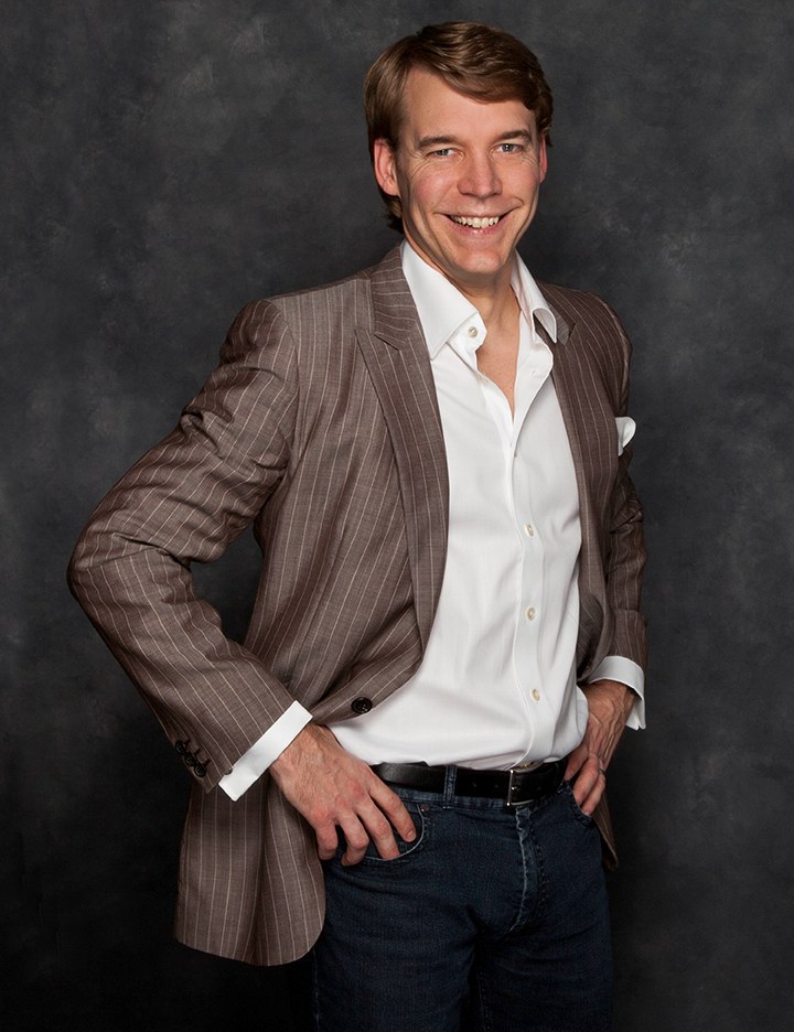
Man with light hair in a brown jacket and open white shirt, hands on hips, dark backdrop, photographed by Annie Watson in her Naples studio
The Short Answer

To build a shot list for a brand session, write one row for every image you actually need, and give each row five things: the destination it is going to, the shape of the frame, how tightly you are cropped, whether you are looking at the lens or doing something, and what words have to sit on top of it.

Ten honest rows is a working plan. Then group the rows by look and background, so the sitting moves forward in an order instead of jumping around, and keep the table afterward: the rows you did not fill are your next list.

A row is a promise to a page.

The list is where a vague ambition turns into an instruction a camera can follow. I need better photos is not a plan. My homepage banner is a stock image of a handshake and I need a wide frame of me with room for a headline is a plan, and it takes fifteen seconds to write down. What a brand session is in the first place is the argument of the guide to personal brand photography. This page is only about the table.

It helps to be strict about what a row is not. It is not an adjective. Approachable, elevated and authentic are useful words for choosing a look and useless as instructions for a frame. They belong on a mood board, which sets the temperature of the whole set and is covered in the guide to mood boards for a brand session. The list sets the inventory. One is about feel, the other about count, and a sitting planned with only the first produces beautiful pictures no page can use.

The five columns, and what each settles.

Every row answers the same five questions in the same order, and the order matters, because each answer narrows the next.

  • Destination. The actual place: homepage banner, About page, services block, profile photo, post, newsletter header, speaker request, deck opener. If you cannot name a place, delete the row. A photograph with no address is the thing that ends up unused.
  • Shape. Wide horizontal, vertical or square. This is decided by the destination and nothing else. A tall frame cannot become a banner and a wide one cannot become a profile photo, so the shape has to be chosen in the room, not rescued in the crop.
  • Crop. How much of you is in it: head and shoulders, waist up, three-quarter length, full length, or a detail with your face soft behind it. Mixed crops are what make a set look accidental, so it is worth deciding rather than discovering.
  • Action. Looking at the lens, or doing something. A good list holds fewer eye-contact frames than you would guess. Most rows want you occupied with something, because a reader takes in an occupied frame quicker than a posed one.
  • Copy. Does anything have to sit on this image? A headline, a button, a name, a logo. If yes, write which side stays empty. This is the column almost nobody fills in, and it is the one that decides whether your web person can use the picture at all.

Five columns, ten rows, one page of paper. That is the entire method. Everything else on this page is how to fill it in without fooling yourself.

A worked list, row by row.

Here is a real one, written for a consultant who sells to other businesses. Read it as a shape rather than a prescription: your destinations are different, but the grammar of a row is the same whatever you sell.

  • Homepage banner. Wide horizontal. Three-quarter length, seated and angled into the light, the frame open on the left. Looking off camera. A headline and a button live in that empty third.
  • About page portrait. Vertical. Waist up, the warmer look, eyes on the lens, with a little space above the head so the layout can breathe. No copy over it.
  • Profile photo, everywhere at once. Square. Head and shoulders, plain background, straight to camera. One frame, used on every account you own, so people recognize you in a small circle.
  • Services page, top block. Horizontal. Standing, mid-explanation, hands moving, plain mid-tone background, right third kept empty for a subheading.
  • Services page, second block. Vertical. Close on the hands doing the thing you are paid for, face soft behind them. No copy over it.
  • Press or speaker request. Vertical. The most formal look, clean background, cropped generously so an editor can crop it their own way without losing your shoulders.
  • Newsletter header. Wide. You small in the frame, mostly background, so the name of the letter can sit across the top without covering your face.
  • Post frames, first look. Vertical, three of them: seated, standing, and mid-sentence. Same clothes, different energy, so one look yields three days of posting rather than one.
  • Post frames, second look. Vertical, three of them, different background, relaxed and warmer, so a feed built from this set does not read as one long afternoon.
  • Deck opener. Horizontal. Full length, formal look, generous space on both sides so the same file survives a title slide and a printed one-page piece.

Ten rows, three looks, two backgrounds. Notice how small that is once it is written down. It is easy to assume you need forty images, and an honest list fits on an index card, which is exactly why it is worth writing.

The two rows people always forget.

Two frames go missing from almost every list, and both of them are the ones a page needs first.

The wide one that is mostly empty

It feels wrong to plan a photograph where you are small and off to one side. It looks, on the back of the camera, like a mistake. Then the headline goes in the empty half and it is the only image on your site that works at full width. Emptiness cannot be added later, so write the row, say which side stays quiet, and trust it.

The one that is just your hands

The second missing row is a close frame of your hands working: the pen, the keyboard, the fabric, the clipboard, the instrument of whatever you do. Your face is soft behind them or out of frame entirely. It is the most reusable picture in a brand set, because it carries no expression to go stale, it crops to any shape, and it sits happily under a block of copy on a services page. Bring the real objects. A borrowed prop reads as borrowed.
Ranking the rows before you cut.

A list of twenty rows is not twice as useful as a list of ten. It is a sitting that runs out of attention. So rank before you cut, and rank by how many eyes the image will actually get rather than by how much you like the idea.

Number every row by the traffic its destination sees. The profile photo is almost always first, because it appears in a hundred places you do not control. The homepage banner is second. Then the About portrait, then whatever page you send people to when you are trying to be hired. Post frames rank high on volume and low on individual weight, so they belong in the middle.

Now cut from the bottom until the table is honest. The test for any row you are unsure about is simple: if this photograph did not exist, what page would be worse? If you cannot answer, it is a row you wrote because it sounded good. Delete it and put the attention into the ones that survived.

Ordering the list so the room runs forward.

A list in destination order is a plan. A list in shooting order is a sitting. They are not the same sequence, and turning one into the other is the last planning step.

Group by look first, because changing clothes is the most expensive move in the room. Every row using the formal look gets shot together, then the working look, then the relaxed one. Inside each look, group by background, so the lights move once instead of four times. Put the profile photo near the front, while everything is crisp, and the mid-laugh frames near the end, when you have loosened up.

Bring the list on paper and we go through it before the sitting. I will tell you which rows are going to work exactly as written and which one needs a different shape, and then we run it. That is the whole reason a content day can produce so much: nothing is being invented while you stand in good light. What else to have settled before you walk in, from the objects to the looks, is laid out in the prep checklist for a brand shoot.

What the list does afterward.

Do not throw the table away when the gallery arrives. Open it beside the images and write a filename into each row. Whoever builds your pages then gets pictures with instructions attached instead of a folder to guess at, which is the difference between images that go up this month and images that go up eventually. The empty rows become visible too: the two destinations you meant to cover and did not are now written in your own handwriting, and they open the next list.

The filled rows have a second life as a publishing plan. Each one already knows where it belongs, which is most of the work of repurposing one sitting across ninety days, and it is why a planned session keeps paying out long after the excitement of a new gallery wears off.

Written this way, the list also quietly prevents the standard failures: no destinations, one outfit, everything cropped tight, nothing left empty for words. Those are catalogued, with the fix beside each, in the guide to brand photography mistakes. And if the whole idea of planning a set rather than booking a portrait is new, start at the personal brand session page and come back here once you know what you are filling.

Key Takeaways
  • A shot list is a table, not a mood: one row for each image, five columns, on a single page of paper.
  • Every row names a destination first, because a photograph with no address is the one that never gets used.
  • Shape and crop are decided in the room and cannot be rescued afterward, so they belong in the plan.
  • Ten honest rows built on three looks and two backgrounds is a full brand set for most people.
  • Write the two rows nobody writes: the wide frame that is mostly empty, and the close one of your hands working.
  • Reorder the finished list by look and background before the sitting, so wardrobe changes happen once each.
  • Keep the table afterward, put a filename in every row, and let the empty rows become your next list.
Next Step

Send me your ten rows.

Even a rough table scribbled in a notebook is enough for me to work from. Tell me the destinations and I will tell you honestly which rows will photograph well in a studio, which one needs a different shape, and which two you are missing. Planning and pricing are both personal, so the best next step is a quick call to (239) 319-6171, or send the form and I will reply myself.

Book a Session Call (239) 319-6171
Put It to Work

Sessions this guide points to.

Good to Know

Questions, answered.

How many rows is too many?
When the rows stop having distinct destinations, you have too many. Twenty rows that cover twelve real places is really twelve rows with duplicates attached. Ten to fourteen is comfortable for one sitting because it usually resolves to three looks and two or three backgrounds. If your table runs past that, split it: shoot the load bearing rows now, and keep the rest as the opening of the next list.
Do I write the list, or does the photographer?
You write the destinations, because you are the only one who knows where your pictures have to live. I write the shapes and the crops, because that is a camera decision. In practice we do it together before the sitting: you bring the places, even messily, and I turn each one into a row that describes a frame. Nobody expects you to arrive with a finished table.
What do I put in the copy column if I do not have my headline yet?
Write which side stays empty and leave the words for later. You do not need the sentence, only the space. Say left third quiet or right half quiet and that is enough to compose the frame. It is much easier to write a headline into a photograph that already has room than to find room in a photograph that has none, so err toward planning more empty space than you think you need.
My work is not visual. What goes in the action column?
Almost every job has an object and a gesture, even the ones that feel abstract. Advisors have documents and a pen. Writers have a keyboard and a notebook. Coaches have a conversation, which photographs as you seated and talking to someone just off camera. If nothing physical exists, use the gesture: mid-explanation, hands moving, caught in the middle of a sentence.
Should the list say what I am wearing in each row?
One word per row is plenty: formal, working, relaxed. The list only needs to know which look a row belongs to so the rows can be grouped for shooting. Choosing the looks themselves is a separate job with its own rules about color, pattern and how a garment behaves in a tight crop, and that is handled in the guide to what to wear for a personal brand shoot.
Book Your Session

Your best headshot is one session away.

Tell me a little about what you have in mind and I will be in touch personally. Pricing is personal, so the best way to plan is a quick call.

Studio
5400 Yahl St, Naples FL

Prefer to talk? Call (239) 319-6171. I respond personally.