A mood board is the most useful thing you can bring to a planning conversation and also the easiest thing to build badly. Sixty images pulled from sixty different worlds tell me nothing except that you like photographs. Ten, with a line under each one saying what caught you about it, tell me almost everything. Here is how to build the second kind.

A mood board for a portrait sitting is a small, annotated collection of images that shows a photographer how you want the pictures to feel: the quality of the light, the color, the tone, the level of formality. It is not a list of poses to copy, and it is not a wish list of places you would like to be photographed. Collect for light and color, write one line under each image saying what drew you to it, cut the whole thing down to about a dozen, and bring your palette along with it.
The test of a good board is simple. Two people looking at it separately would describe roughly the same photograph.
A mood board exists to solve a translation problem. You have a feeling about how you want to look, and the only words most people have for it are soft, professional, warm, elevated, natural. Those words mean six different things to six different people, and none of them describe a photograph anybody could go and make.
Images fix that instantly. Point at a picture and say the light in this one, and there is nothing left to misunderstand. That is the entire function: turning an adjective into something specific enough to work from. A board is a vocabulary, not a shopping list.
It also does something quieter. Building one forces you to notice what you actually respond to, which is often not what you have been telling people. If you have described your brand as bright and airy for a year and then assemble a board that is unmistakably moody and low key, that gap is worth finding before the sitting rather than during it.
The board sits alongside the rest of your planning rather than instead of it, and it only says how the pictures should feel. The list of what has to be made is the brand shoot shot list, the practical run-up is the prep checklist for a brand sitting, and how all three fit together is covered in personal brand photography.
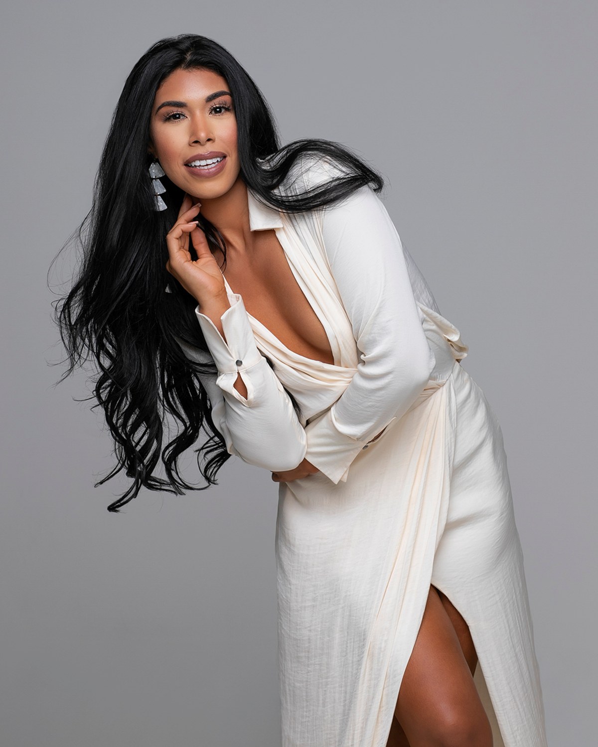
Most boards are built by saving images of people standing in ways the collector admires. That is the least transferable thing on the page. Posing gets directed in the room, adjusted for your body and your clothes, and changed six times in a minute, so a saved pose is information nobody needs in advance.
What does transfer is the light. When you find an image you like, look past the person and ask a few plain questions about how it was lit.
Five images answered that way are worth fifty saved on instinct. You are collecting the recipe rather than the result, and the recipe is the part that can be rebuilt for you.
The commonest way a board misleads is by filling up with rooms. A converted warehouse with enormous windows. A kitchen the size of a small apartment. A field at the end of the day. These get saved because they are beautiful, and then they set an expectation a studio sitting cannot meet.
Every session I photograph happens in my Naples studio: a private, air-conditioned room with several backdrops and room to change between looks. So if half your board is architecture, we should talk about it beforehand.
The useful move is to look at those images again and separate what you are responding to from where it happened. Almost always, the thing you liked survives the location.
What does not survive is the room itself. Say so on the board, in your own words: I want this light and this palette, not this warehouse. Then the image becomes useful instead of misleading.
An unannotated board is genuinely ambiguous. Take one image: a woman in a dark blazer, laughing, against a plain gray background, warm light from the left. Saving that might mean the laugh, the blazer, the gray, the warmth, or simply that she looks like your sister. Five different sittings hide in one saved picture.
So write a line under each one. It does not need to be technical or well phrased. It needs to name the one thing, in your words rather than my assumption.
The lines are also where you can be negative, and negative notes are often the most useful ones on the board. Too formal for me. I would never wear this. Close, but too dark. Knowing where your edges are saves more planning time than admiration does.
If you find yourself writing the same line under four images, you have found your real brief. That repeated note matters more than everything else on the page.
A long board is not a thorough board. Past a dozen images, every addition dilutes the ones already there, and a board containing everything communicates nothing. Cutting is what makes it work.
Go through it three times, each pass for one reason only.
When you are finished, the board should be small enough to hold in your head: a dozen images, each with a line, arranged so the pattern is obvious at a glance.
The contradiction to look for is a board split down the middle: half of it dark, contrasty and serious, half of it bright, open and airy. Both halves are fine. Together they describe two different sittings, and if nobody notices before the day, you get a set that never quite settles into one voice.
You have two honest options. Cut one half, or keep both and label them as separate looks, so the board reads as look one and look two rather than as a single confused mood. The second is often right for a library, which genuinely needs more than one register, as long as it is planned that way rather than discovered halfway through. Holding a set to one voice across many frames is visual brand consistency.
The single most useful thing you can add to a board is your actual palette: the colors your site, your slides and your graphics already use. Not described in words, but shown, as swatches or a screenshot of the pages themselves.
The reason is practical. Your photographs are going to be looked at while surrounded by those colors, which means the wardrobe and the background have to sit with them rather than fight them. A rich rust jacket is a lovely choice and a poor one against a page built on cool blues, and that is not visible while you are standing in front of a mirror at home.
Two rules cover most of it. Let the strongest color in the frame be one your brand already owns, so the pictures belong to the pages they land on. And do not dress in the same shade as the backdrop unless you want a floating head, which is occasionally the point and usually not.
Which of your own colors are worth wearing, and which look better as a background than on a body, is worked through in dressing for your brand colors. Bring the palette anyway, even if you have not decided. It changes the wardrobe conversation completely.
Once we have talked it through, the board stops being a collection and becomes a plan. Two or three lighting directions, a palette, a formality level, and a clear sense of which images you liked for the light and which for the clothes. That is what the wardrobe conversation runs on, and it is why we can plan looks together instead of guessing at each other.
What it does not become is a checklist to reproduce frame by frame. Copying a photograph exactly is the one thing a board should never be used for: the person in the reference is not you and was not lit for your face. The feel carries over. The frame does not.
Bring it however it exists, as a saved folder, a document or screenshots on a phone. The lines matter and the layout does not.
One board comfortably covers an entire content day as well as a single sitting, because the whole point of a mood board is that it defines a look rather than a shot count. If you are still deciding whether a full library is the right thing to commission at all, that argument is whether brand photography is worth it, and it is a separate question from how the pictures should feel.
Twelve images with a line under each, plus the colors your site already uses, and we can plan a sitting instead of trading adjectives. If half of them turn out to be beautiful rooms, we will work out what you actually wanted from them. See the personal brand work first if you like. Pricing is personal and so is planning, so call (239) 319-6171 or send the form.
Book a Session Call (239) 319-6171Tell me a little about what you have in mind and I will be in touch personally. Pricing is personal, so the best way to plan is a quick call.
Share a few details and Annie will be in touch personally.