Portfolio
Headshots Boudoir Personal Brand
More
Guides Investment Guided Posing About Book a Session
Home  /  Guides  /  Where to Put Your New Headshot
Knowledge

Where to put your new headshot.

A new portrait is worth nothing while it sits in a folder. The week after delivery is a small job with a long list: the profiles, your own site, the signature nobody thinks about, the listings you forgot you were in. Here is the list, in the order worth doing it, with the crop each place expects.

By Annie Watson · Naples, Florida · Updated September 2026
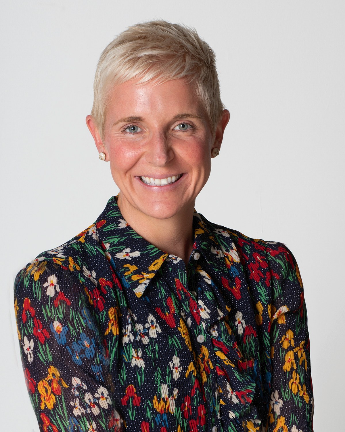
Woman with short blonde hair in a floral shirt, laughing, gray backdrop, photographed by Annie Watson in her Naples studio
The Short Answer

Do the three that get seen most first: the professional profile people open before meeting you, your own website, and the signature at the bottom of your mail. Then work outward through your other profiles, your industry and association listings, the accounts you sign into, and anything printed.

The crops differ by destination and that is what trips people up. A profile wants a square that survives being cut into a circle, a site header wants a wide frame with room around you, a portrait slot on a bio page usually wants an upright crop, and print wants the largest original you hold, prepared for ink rather than for a screen. Upload the biggest version each place accepts and let it do the shrinking.

Start with the three that get looked at.

Order matters here only because momentum does. Three places carry most of the traffic, and if you never get past them the portrait is already doing the work you had it made for.

  • The professional profile somebody opens before a first meeting. This is the one that gets compared with your handshake.
  • Your own website, wherever your name appears with a paragraph beside it.
  • Your mail signature, which is quietly the most repeated impression you make.

Update all three in one sitting rather than promising yourself the rest later, because the rest is where the list goes to die. If you have not settled on which frames go where yet, do that first: choosing images from your gallery gives you a method that takes an hour rather than a fortnight.

For the profile itself, LinkedIn has enough specifics of its own to fill a page, and they are in the LinkedIn profile photo guide.

The crop each place actually wants.

One photograph, several shapes. Almost every upload problem is a crop problem, and the fixes are mechanical.

  • Square, cut to a circle: most profiles. Keep your head off center and leave air above it, because the circle bites the corners and takes the top of your hair with them.
  • Wide, roughly 16:9: site headers, banners and slides. This needs space beside you that a tight headshot crop has already thrown away, so use a wider frame rather than stretching a tight one.
  • Upright, roughly 4:5: bio pages, directory cards and printed programs. The most forgiving shape for a portrait, and the one to ask for if you only keep two.
  • Full original: anything going to a printer or a designer. Hand it over untouched and let them crop.

Two habits prevent most of the damage. Upload the largest version the place accepts, so its own compression works from good material rather than from a copy you already shrank. And crop duplicates, never the master, so the original stays available when the next shape comes along.

Where a crop is going onto paper, the shape question turns into a size question as well, and print sizes and cropping covers what each standard size does to a head.

The profiles, in one pass.

Go through them in one sitting with the square crop open in front of you. The tedium is the whole difficulty: none of these takes more than a minute, and having them disagree with each other is worse than any single one being imperfect.

  • LinkedIn, where a profile picture usually does the most work.
  • Instagram, where the same square gets cropped again and shown tiny.
  • Facebook, if you use it for anything with your name attached to it.
  • YouTube and podcast platforms, if you appear on either as a host or a guest.
  • The speaker profile on any conference site that still lists you.

Consistency across them is worth more than picking the perfect frame for each. When the same face appears everywhere, somebody moving between two of your profiles recognizes you instantly, which is most of what a portrait is for. If your profile picture is the whole reason you are booking a session, the LinkedIn headshots page describes what that sitting is built around.

Your own website, done properly.

Your site is the one place where you control the size, the shape and the surroundings, so it deserves more than a drag and drop.

  • The about page, where the upright crop belongs and where people read your words with your face beside them.
  • The header or hero, if your design uses one, which wants the wide frame and room for text to sit over it.
  • The team page, where your crop and background should match everyone else's rather than announce that yours is newer.
  • The contact page, because a face beside a form does more than another paragraph of reassurance.

Two technical steps take five minutes and pay for themselves. Give each image a descriptive file name and honest alt text before it goes up, and compress it for the web so the page still loads quickly. Both are covered in naming your headshot files for a site.

If the about page is the reason you are here, the words and the picture want to be planned together, which is what the about page guide is about.

The listings everybody forgets.

This is where a good portrait quietly fails to arrive: the accounts and listings that carry your face without you thinking about them. Work through the list once and you will not have to think about it again until the next session.

  • The directories your industry actually uses, including any professional body you belong to.
  • Association and chamber member listings, which often still show a picture from whenever you joined.
  • Your account picture on the mail and calendar system you use, which appears on every invitation you send.
  • The meeting software you sign into, where your picture sits on screen whenever your camera is off.
  • Author or contributor pages on anywhere you have written or been quoted.
  • Booking, scheduling and payment tools that show your face to a customer before you appear.
  • Any newsletter template with your portrait in the footer.

Search your own name and go through the first two pages of results. Whatever you find with a face on it is either yours to update or worth asking somebody to update, and it is almost always the oldest picture in circulation.

Anything printed, anything framed.

Print is a different job from a screen and asks for a different file, because ink on paper cannot reach every color a lit screen can produce. Send an image prepared for the web to a press and it can come back flat, dark or oddly gray.

So when a program, a printed page or a press request arrives, send the full original and say what it is for. Whoever prints it will prepare it for their own process. The whole business of color for ink against color for screens is explained in the difference between sRGB and CMYK, and it is worth understanding before a deadline rather than during one.

Press and media requests deserve a small kit of their own: an upright portrait, a wider frame, a short biography and the correct spelling of your name in one folder, ready to send. That is the argument of press and media kit photos.

If a portrait is going on a wall rather than into a document, the surface changes the picture as much as the size does, and canvas, metal and paper compares what each one does to a face.

The old picture, and the next sweep.

The last task is subtraction. Somewhere out there the previous photograph is still working on your behalf, and it is usually the one you liked least. Take it down where you control it, ask where you do not, and accept that a couple of stragglers will outlive you both.

Then make the whole thing repeatable. Keep one folder holding the master images and the crops you made, named so that the next person who needs a picture of you can be sent a link instead of a question. Everything about keeping those originals safe is in what you get with your digital files.

Run the sweep again whenever something changes: a new role, a new title, a different look, or the point at which you no longer look much like your own picture. How often that is, honestly, is the subject of how often to refresh a headshot.

And if you want the whole subject in one place, from what a portrait is for to what happens after it is delivered, the complete guide to professional headshots runs the length of it. What a sitting itself involves is on the headshots page.

Key Takeaways
  • Do the profile, your website and your mail signature first, in one sitting, because those three carry your face to nearly everyone who looks you up.
  • Keep a square that survives a circular crop, a wide frame for headers and banners, an upright crop for bios, and the untouched original for print.
  • Upload the largest version each place accepts and crop duplicates rather than the master, so the original is still there for the next shape.
  • Update every profile in one pass so they agree with each other, since recognition matters more than picking a perfect frame for each.
  • Work through the forgotten places too: industry directories, association listings, the account picture on your calendar, and anything with your name on it.
  • Send the full original to anyone printing, and set a reminder to run the whole sweep again when your role or your look changes.
Next Step

One session, many destinations.

If this list made you notice how many places carry your face, bring the list to the call. Knowing where the pictures have to work is what decides how many looks a sitting should cover and which crops are worth making at the time rather than afterward. Call me at (239) 319-6171 or send the form and we will plan it around your list.

Book a Session Call (239) 319-6171
Put It to Work

Sessions this guide points to.

Good to Know

Questions, answered.

Should the same photograph go everywhere, or should each place get its own?
The same face everywhere, in whatever shape each place needs. Recognition is the point: somebody who moves from your profile to your site should not have to check they are in the right place. Vary the crop as much as the destination requires, and vary the actual frame only where the tone genuinely differs, such as a formal bio page against a lighter social profile.
Why does my picture look soft after I upload it?
Almost every platform re-compresses what you send and then displays it small, so an image that was already reduced gets reduced again and loses its edges. Upload the largest version the place accepts and let its own processing do the shrinking. If it still looks soft, check you are not uploading a copy you cropped out of a copy, which is the usual culprit.
Do I need a headshot in my mail signature?
It helps more than people expect, particularly if you send a lot of first messages to strangers. Keep it small, square and light in file size so it does not bloat every message, and use the same frame as your profile so the two agree. If your signature is going out to a list rather than to individuals, the same picture works there too.
My company has a set style for the team page. What do I send them?
Ask what background, crop and file size they want, then send the full original with the request rather than a version you cropped yourself. Whoever maintains the page can match it to the others properly. If the whole team is being photographed together, matching happens at the sitting rather than afterward, which is why background and crop are decided before anybody arrives.
How do I get an old photo of me taken down from somebody else's site?
Ask, plainly, and make it easy. Send a short message with the new picture attached at full size, the file named clearly, and a line saying which page it replaces. Most people are glad to swap it and simply need the material in front of them. Where nobody responds, keep a note of it and try again next time you have a reason to be in touch.
What size file should I keep on hand for requests?
Keep the untouched original, plus one upright crop and one wide crop at full size. That trio answers nearly every request without you going back to the gallery. Send the original whenever somebody printing asks, and one of the crops when somebody is putting you on a screen. Never send the small copy you use online to anybody who mentions paper.
Book Your Session

Your best headshot is one session away.

Tell me a little about what you have in mind and I will be in touch personally. Pricing is personal, so the best way to plan is a quick call.

Studio
5400 Yahl St, Naples FL

Prefer to talk? Call (239) 319-6171. I respond personally.