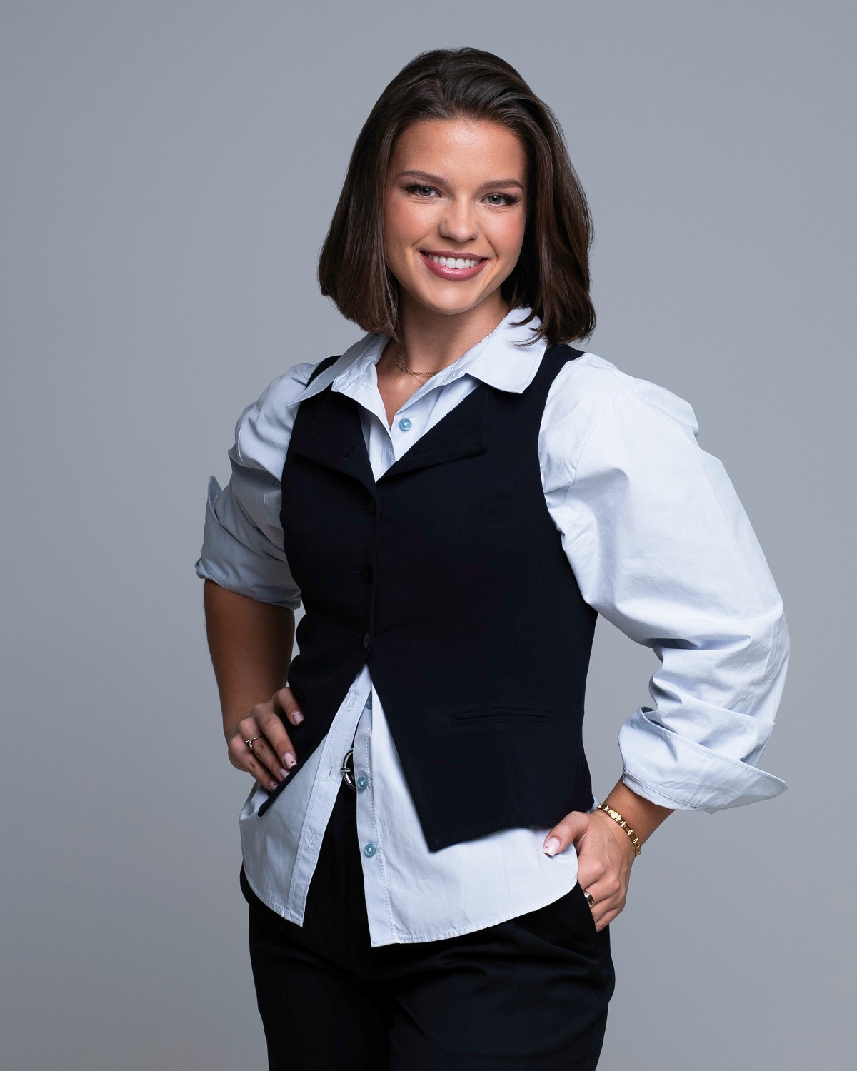
The About page is where somebody goes when they have decided you might be the answer and want to know who they would be dealing with. It gets read closely by exactly the people you want, and it very often carries the worst picture on the site: an old profile crop, blown up, sitting alone above nine paragraphs.

An About page needs three photographs, not one. A portrait that reads as you at conversational distance, a wider frame with empty space on one side so text can sit beside it, and one image that shows the work rather than the face. Between them they answer the three questions a visitor is actually asking: who are you, do I want to deal with you, and are you any good at this.
Keep the About portrait distinct from the picture in the site header. If the same frame appears twice on the way down the page, the second one stops being information.
Nobody opens an About page to be entertained. They open it after something else has gone well: a search result led somewhere useful, a page answered their question, a friend passed on your name. The visit is a verification. The unspoken question is whether the competent thing they just read came from a person they would want on the phone.
That is a question a photograph answers faster than a paragraph does, which is why the picture carries more weight here than anywhere else on the site except the header. And it is why the failure is so common: the copy on an About page usually gets written and rewritten, while the photograph is whatever was already on the hard drive.
So the standard to hold it to is not "is this a nice picture of me". It is "does this look like the person who wrote the page above it". Those are different tests, and the second one is the one that matters here.
Almost every good About page is built from the same three images, in this order down the page.
Not the tightest crop you own. An About portrait sits somewhere between a profile picture and a portrait: head and shoulders with a little air, an expression that matches the voice of the page it sits on, and eye contact. The visitor is trying to imagine speaking to you, so give them the version of you that is about to speak. The mechanics of getting that frame are in the complete guide to professional headshots.
This is the picture almost nobody has, and the one every layout wants: a horizontal or three-quarter frame where you sit to one side and the other side is deliberately empty. It is what a designer needs when a heading and a paragraph have to sit beside a picture rather than under it. Without one, the design either crops your head or floats your portrait in the middle of a column looking like a passport.
Something that shows the work, the tools, the hands, the setting in which you think. It gives the page rhythm and it gives the reader evidence. A page made entirely of portraits of one person is a page about a person; a page with one working frame in it is a page about what that person does. Building that mix is what personal brand sessions are for, and the personal brand photography guide explains how a library gets planned.
The most common structural mistake on a one-person site is a single photograph used twice: large at the top, smaller again on the About page. It feels efficient. It reads as thin.
The two pictures are doing opposite jobs. The header image is an invitation, made to be seen for a fraction of a second while somebody decides whether to stay, so it can be wide, atmospheric and cropped hard. The About photograph is a meeting, looked at deliberately, at close range, by somebody who has already decided to pay attention. Atmosphere is wasted there. Legibility is not.
There is also a repetition cost. The second appearance of an identical frame quietly tells a reader there is nothing more to see. Two different frames from the same sitting, in the same light, with the same wardrobe, tell them the opposite: that there is a person here with more than one angle. The website hero image has its own page, because what the top of a site needs is a genuinely different problem.
Whatever you supply, a template will reshape. Knowing the shapes in advance is the difference between a photograph that survives the crop and one that gets ruined by it.
The practical instruction that covers all of them: shoot looser than the final crop, and shoot the same look in more than one orientation. A crop can always be taken out of a wider frame. Nothing can be added back to a tight one. Backgrounds, orientation and crop are decided at the time of the sitting rather than repaired afterwards, which is why the pages a picture is destined for are worth naming before the camera comes out.
An About photograph does not live alone. It sits inside a color scheme, next to a typeface, above a form, and the picture that looked wonderful on its own can fight all of it.
Two things worth checking before you commit. First, the tone of the background against the page: a light gray studio background disappears into a white page and can leave you looking like a floating cut-out, while a slightly darker field gives the picture an edge and holds it in place. Second, the color temperature: a warm portrait on a cool blue site reads as borrowed from somewhere else.
Black and white solves several of these problems at once and creates one of its own. It removes the color clash entirely and it looks deliberate. It also removes information, which matters more on an About page than on a profile, because part of what the reader is doing is simply working out what you look like. Black and white headshots covers when it is the right call, and the safest version is to run the portrait in color and let a secondary frame carry the black and white.
If your site is being built or rebuilt around these pictures rather than the other way round, website and brand imagery is the session that starts from the pages themselves.
In rough order of how often they turn up:
There is a quieter mistake that belongs on the list too: no picture at all, replaced by a logo or an illustration. On a page whose entire purpose is to introduce a human being, that is an odd choice, and readers notice the absence more than they would notice an imperfect photograph.
One sitting solves most of this list, because several looks and several crops are planned together in advance rather than assembled from whatever exists. If the same images will also be sent to organizers and editors, press and media kit photos covers what that separate set needs to include.
Placement usually gets left to the template, and it is worth one decision of your own. The portrait belongs high, beside or just above the opening paragraph, where somebody who came here to check you out finds it without scrolling for it. The wider frame with copy space belongs further down, carrying a heading or a section break. The working frame belongs near the end, next to whatever you want the visit to turn into.
A short line of text under the portrait is worth writing while you are there. It can say something the picture cannot, where you work or what you actually do, and it gives a reader who is skimming one more fact without asking them to read the paragraph beside it.
Then there is the housekeeping every picture on a site needs and almost nobody does: a file sized for the space rather than the largest version you own, a name that says who is in it, and an alt line written in plain words for somebody who cannot see the image. None of it is specific to an About page, and naming headshot files and writing alt text covers it properly.
An About page wants three frames rather than one, and they are far easier to plan together than to collect one at a time afterwards. Tell me what the page has to say about you, and we can work out the three it needs: the portrait, the one with room for words beside it, and the one that shows what you actually do. Call (239) 319-6171 or send the form, and I will reply myself.
Book a Session Call (239) 319-6171Tell me a little about what you have in mind and I will be in touch personally. Pricing is personal, so the best way to plan is a quick call.
Share a few details and Annie will be in touch personally.