Portfolio
Headshots Boudoir Personal Brand
More
Guides Investment Guided Posing About Book a Session
Home  /  Guides  /  Photos for a Press Kit or Media Kit
Career

The photo set a press kit actually needs.

Someone has asked you for photos. A program, a publication, a conference, a partner's site. You send the one portrait you own, and two days later they come back asking for something horizontal, or larger, or with space for a headline. This is the set that answers every version of that request the first time.

By Annie Watson · Naples, Florida · Updated September 2026
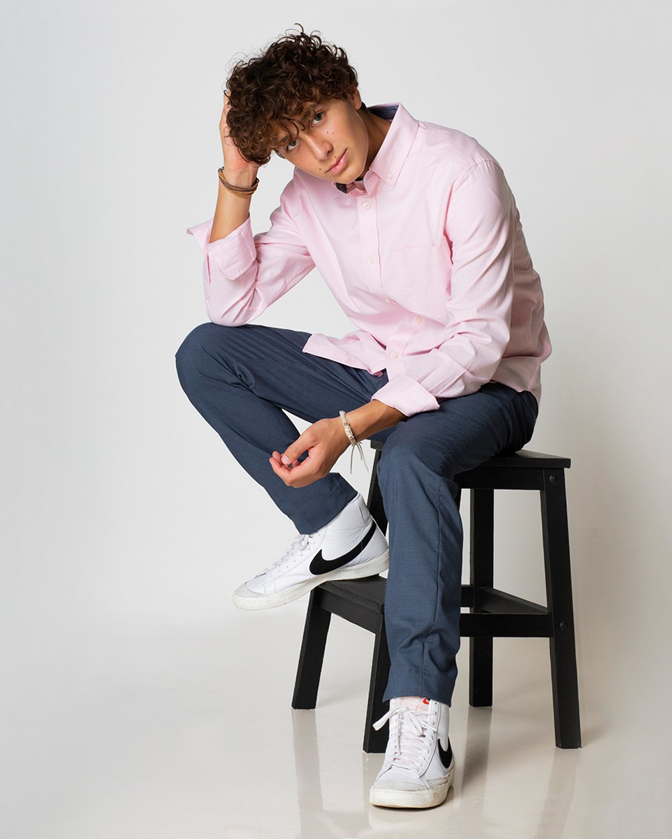
Young man with curly hair in a pink shirt and jeans, seated on a stool, white backdrop, photographed by Annie Watson in her Naples studio
The Short Answer

A press kit needs a small set of images rather than one picture, because you do not control the shape your photograph is about to be poured into. The working set is a tight vertical head and shoulders, a looser vertical you can crop down, and a horizontal frame with open space on one side where a headline can sit. Each one supplied twice, at print resolution and at web size, on a background plain enough that an editor can crop into it.

Then add the text that travels with the pictures: a one-line caption, a credit line, and your own name inside every file name. A set like that answers nearly every request anyone will make of you, and it removes the round trip that makes people quietly use a different photograph instead.

What an editor is really asking for.

When somebody asks for a photo, they are almost never asking for a photo. They are asking for something that will fill a hole whose shape they may not know yet. A vertical column beside text. A horizontal banner across the top of a page. A square card. A full-page opener with your face on the right and a headline on the left.

They also have two output paths in mind that have nothing to do with each other. One is a screen, where the file will be shrunk. The other is paper, where it may be enlarged, and where every flaw is enlarged with it.

So when you send one file, one of three things happens. It fits, which is luck. It gets cropped badly, which is your problem more than theirs. Or someone comes back to ask, which costs a day and sometimes costs you the placement. A kit makes the first outcome the only outcome.

The set that covers almost every request.

This is a small number of frames, all from one sitting, chosen so that between them they can be cropped into anything:

  • A tight vertical, head and shoulders. This is the workhorse: bios, programs, speaker listings, narrow columns, anywhere your face has to be readable small.
  • A looser vertical, roughly waist up. It fills a tall slot on its own and it can be cropped down to the tight version, which means it doubles as insurance.
  • A horizontal with open space on one side. This is the frame nobody thinks to ask for and everybody eventually needs, because a headline has to sit somewhere and a centered head leaves it nowhere to go.
  • A frame that survives a square crop. Social cards and directory tiles cut to a square without asking, and a composition that only works as a tall rectangle loses its head to that crop.
  • One light background and one darker one. Pages are designed in light and dark, and a portrait on a pale backdrop can dissolve into a white layout while a dark one disappears into a dark header.
  • A monochrome conversion of your primary frame, made deliberately rather than by desaturating it, since some outlets run everything in one tone. When that is the right call is its own decision, laid out in when black and white is the right choice.

How formal the whole set should read is a separate question, and it is decided by your field rather than by your taste: the conventions are gathered in industry headshot norms.

Notice that this is five or six frames, not fifty. A kit is not a gallery. Every image in it should have a job you can name in a few words.

Every picture twice: print size and screen size.

Print and screen want opposite things and there is no single file that satisfies both. Print has traditionally been prepared around 300 dots per inch, which means a photograph running the width of a page needs a great deal more picture information than the same photograph running across a browser window. Screen work wants the opposite: something light enough to load.

The direction of travel only goes one way. A large file can be reduced to any smaller size and still hold together. A small file cannot be enlarged, because the detail was never recorded and no amount of processing invents it truthfully. So supply the large one, and supply a reduced version alongside it so that nobody drops a print file onto a web page and slows it to a crawl.

This is also where generated images fail a print request, and it is worth understanding why before you rely on one for a kit. A model produces plausible texture rather than a record of a real surface, and plausible texture is convincing at thumbnail size and falls apart when it is enlarged and printed. I have compared the two approaches in full in AI headshots against real photography.

Three habits ruin otherwise good files: sending a photograph pulled out of a slide deck, which has usually been compressed already; sending a screenshot of a photograph; and sending something enlarged from a small original. If you want the sizes worked through properly, what resolution do I need does it.

Leave them room to crop.

An editor can crop in. Nobody can crop out. That single sentence decides how a press set should be framed.

It means the images you supply should be a little looser than the images you would post yourself. Space above the head, space beside the shoulders, a background that continues past the edge of the subject. A portrait cropped tight to the hairline is finished, and finished is the opposite of useful here: it can only be used at the one shape you chose.

It helps to know the shapes it will be cut into. Vertical layouts tend toward a four to five proportion, tiles cut square, and banners run wide, often close to sixteen to nine. A wide crop taken from a vertical portrait slices horizontally across the eyes unless there was room to move.

One placement rule survives every crop: eyes in the upper third of the frame. Do that and a picture stays readable through almost any reshaping. Ignore it and a square crop leaves you floating in the middle of the box with your chin at the bottom edge.

The caption, the credit and the file name.

Photographs travel without you, so the words attached to them have to do the explaining. Three pieces are worth preparing once and reusing forever.

The caption is one line: your name spelled exactly as you want it printed, your title, and your organization if it is relevant. Send it as text alongside the image rather than assuming anyone will look it up. A caption is easy to get wrong and hard to correct once it has run, and the version you supplied is the version that gets used.

The credit line is the photographer's name, in the form they use. Ask for it, and ask at the same time what use the images are cleared for, because that varies from one photographer to another and it is not something to assume from a previous job. Getting a straight answer to that question before you send anything anywhere is part of what a good working relationship looks like.

File names matter more than people expect, because your file lands in a folder beside everyone else's, all named the same unhelpful string of digits. Use your name, then what the file is: the shape, and whether it is the print or the screen version. The wider case for naming files properly, including what it does for your own search results, is in headshot file names.

How to hand it over without friction.

Send one link to one folder. Inside it, the files named as above, and a short index: a line each saying what the image is and what it suits. That index is the difference between a kit somebody uses and a kit somebody scrolls past.

Do not attach a stack of large files to an email, because mail systems cap what they will carry and some of them shrink images on the way out. And do not paste the pictures into a document, which compresses them and hands the recipient an image they have to dig back out before they can use it.

The permanent version of this lives on your own site: a small page carrying your bio in two lengths, your caption line, the credit, and the same images available to download. Then the answer to any request is a single link that never expires and never needs assembling again. What belongs on those pages, and how the imagery should hold together across them, is covered in website and brand imagery.

One thing not to do: send someone to a social profile to screengrab from. What they take is a compressed, resized copy with the wrong crop, and it will represent you in print.

Why kits go stale and when to rebuild.

Press photographs have a long half-life. Once an outlet has a file of you, that file is what gets used the next time your name comes up, and the next time after that. A picture you were lukewarm about in the beginning becomes the picture of you, simply by being the one on hand.

That argues for two things. Send the photograph you actually want in circulation rather than the most convenient one. And when it stops being accurate, replace it everywhere at once instead of adding a new one to the pile, because the old file does not remove itself.

The other thing that ages a kit is incoherence. A set assembled over several years, in different light, reads as several different people, and the mismatch is obvious the moment two of the images sit on one page. A kit made from a single sitting holds together whichever frame gets chosen.

If your photographs are working across a kit, a site, a deck and a feed all at once, you are past the single portrait and into a library, which is what personal brand sessions are built to produce. The thinking behind that library, and how to plan one, is in personal brand photography. And if all you need is the one strong frame the rest hangs from, start with professional headshots.

Key Takeaways
  • An editor is filling a shape you cannot predict, so a kit supplies a tight vertical, a looser vertical and a horizontal with open space for a headline.
  • Supply every frame twice, at print resolution and at screen size, because a large file reduces cleanly and a small one cannot be enlarged truthfully.
  • Frame a little loose and keep your eyes in the upper third, since an editor can crop in and nobody can crop out.
  • Attach the words as well as the pictures: a caption with your name spelled correctly, the credit line your photographer uses, and file names that carry your name and the shape.
  • Build the set from one sitting so it stays coherent, and replace it everywhere at once when it stops being accurate.
Next Step

Build the set once, answer every request.

A press set is not one picture. It is a tight vertical, a looser one, a horizontal with room for a headline, and the print and screen versions of each, planned before anyone picks up a camera. If someone has asked you for photos and you are not sure what to send, call me at (239) 319-6171 or use the form and we will work out the set your kit needs.

Book a Session Call (239) 319-6171
Put It to Work

Sessions this guide points to.

Good to Know

Questions, answered.

How many images does a press kit actually need?
Five or six frames, in print and screen versions, covers almost everything. A tight vertical, a looser vertical, a horizontal with open space, something that survives a square crop, and a light and a dark background between them. More than that is not generosity, it is indecision, and it pushes the choice back onto someone who has less reason to care which frame represents you.
Can I just send a link to my profile picture?
It is the most common shortcut and it usually costs you. A profile image has already been resized and compressed for the screen, and it is cropped square or round, which is the one shape a page layout is least likely to want. What comes back is a small, soft file with no room to crop. Send an original from the sitting instead, at full size, and let the recipient reduce it.
Who owns the photograph, and can the publication use it?
Ownership and permitted use vary from one photographer to another, so this is not a question to answer from a general article or from what a previous photographer allowed. Ask directly, before the images go anywhere: what the credit line should say, and what uses are cleared. Any photographer worth working with will tell you plainly. If you would like to talk that through for your own set, a call sorts it in a few minutes.
Do I need a horizontal frame if everything I do lives on a phone?
Yes, and it is the one people skip. The moment your name appears on a page with a headline over the image, in a program, on a partner's site or across the top of an article, that layout needs width and it needs empty space for type. A vertical portrait cropped to fit a banner cuts straight across your eyes. It costs nothing to shoot the horizontal while you are already there.
Should my press photo be the same as my profile photo?
Same person, same sitting, not necessarily the same frame. Recognition works in your favor, so the whole set should look like it was made on one day by one person. But the profile wants a tight, plain, instantly readable crop, while a press set wants room to breathe and room to crop. Take both from the same sitting and they will be consistent without being identical.
Book Your Session

Your best headshot is one session away.

Tell me a little about what you have in mind and I will be in touch personally. Pricing is personal, so the best way to plan is a quick call.

Studio
5400 Yahl St, Naples FL

Prefer to talk? Call (239) 319-6171. I respond personally.