Portfolio
Headshots Boudoir Personal Brand
More
Guides Investment Guided Posing About Book a Session
Home  /  Guides  /  Dressing in Your Brand Colors for a Photoshoot
Wardrobe

Dressing in your brand colors.

You want your photos to look like you online: the same palette as your website, your feed, your deck. That is a good instinct. The usual mistake chasing it is wearing the whole palette at once, head to toe, and ending up looking less like a brand and more like its mascot.

By Annie Watson · Naples, Florida · Updated September 2026
Woman with blonde hair in a purple sweater, hand on hip, gray backdrop, photographed by Annie Watson in her Naples studio
The Short Answer

Use your brand color as an accent, not an outfit. A single garment, a blazer, a top, a scarf, in your palette, paired with neutrals that do not compete, reads as intentional and on-brand. Wearing your exact logo color from head to toe, especially if it is bright or unusual, tends to read as a costume instead.

The other lever worth using is the background, not just the clothing. A backdrop, or a small object you bring and hold in frame, in your color can carry the brand association while your outfit stays simple and flattering, which usually photographs better than the color competing directly with your face.

Your brand color is an accent, not a uniform.

The instinct to wear your brand color makes sense: consistency matters, and a personal brand session is partly about building a visual language you can reuse. Where it goes wrong is treating the color like a dress code, matching it in the top, the jacket, the accessories and sometimes the pants all at once.

One saturated element does the job a whole outfit cannot. A blazer in your brand blue over a neutral top, or a single bold accessory against an otherwise quiet outfit, signals the palette without overwhelming the photograph or turning your face into the second most interesting thing in the frame.

Neutrals that let the accent do the work.

Pick your neutral first, then let the brand color sit next to it. Charcoal, cream, camel, navy and soft grey all sit quietly behind a stronger accent color without fighting it or looking like an afterthought. The goal is a neutral that feels considered, not simply whatever was clean in the closet.

  • Warm brand colors, oranges, warm reds, golden yellows, pair well with cream, camel and warm greys.
  • Cool brand colors, blues, teals, cool greens, pair well with charcoal, navy and cool greys.
  • Black works as a neutral with almost any brand color, though it can feel severe for a personal brand session aiming for approachable rather than corporate.

For the fundamentals of color choice beyond brand matching, color families, undertones, what flatters which skin tone, best colors to wear for photos is worth reading alongside this page.

It helps to test the pairing before the day of your session rather than guessing from a swatch. Hold the neutral and the accent piece together in daylight, not under an indoor bulb, since indoor lighting shifts how warm or cool a color reads. If the two fight each other in that light, they will fight each other under studio light too, and it is easier to solve that at home than in front of the camera.
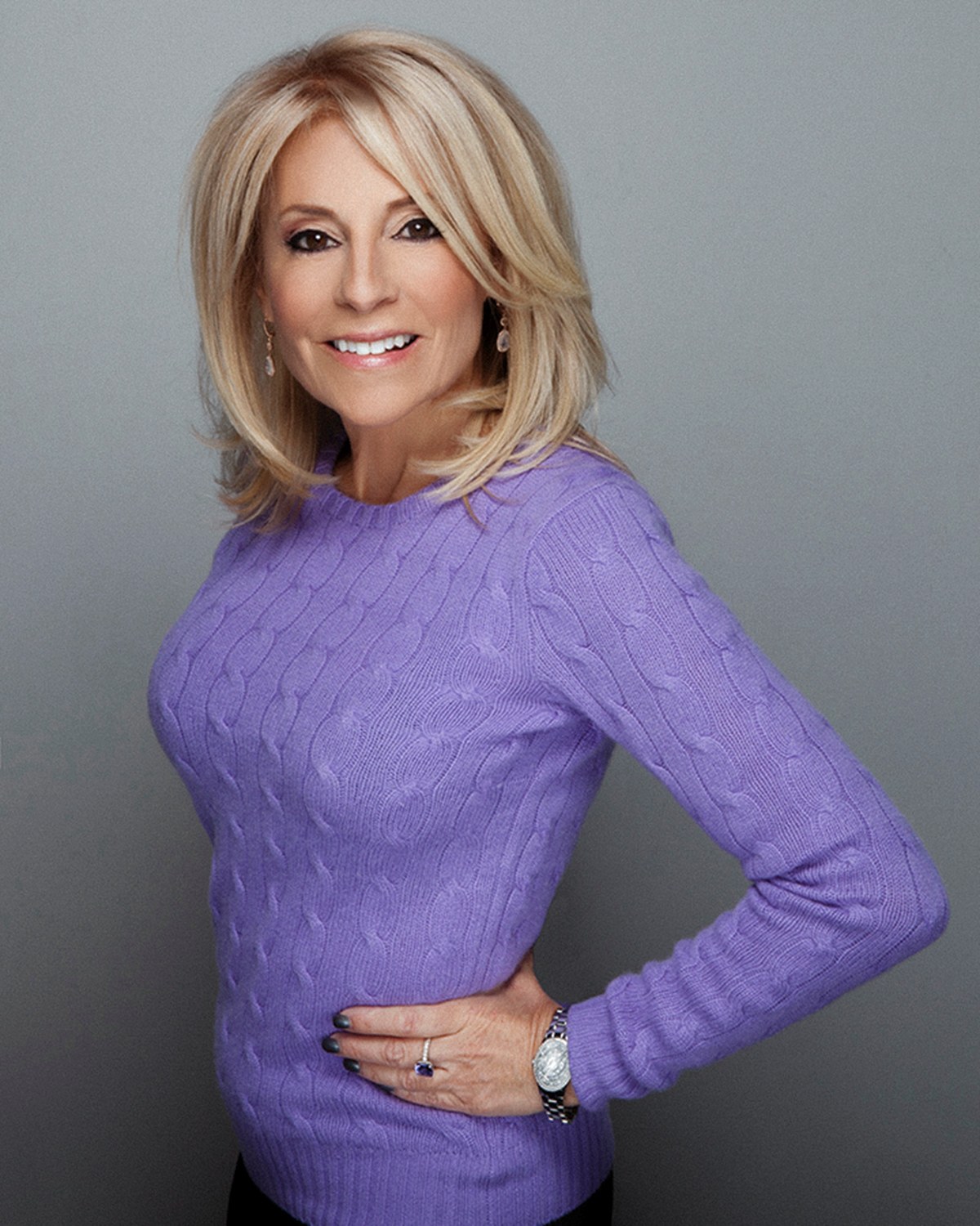
One accent color, not several at once.

A common misstep once someone commits to the accent approach is reaching for more than one bold element: the brand-colored blazer, plus a matching bag or a bright accessory in a second color, plus a patterned top underneath. Each addition dilutes the others, and the eye stops knowing which color it is supposed to register as the brand cue.

Pick one place for the accent to live, the jacket, the top, or a single accessory, and let everything else genuinely recede. If you are torn between two elements that could carry the color, choose the one closest to your face; a collar or a top reads faster than a bag or shoes ever will in a photograph focused on you.

Put the color on the background, not just the outfit.

Clothing is not the only place a brand color can live in a photograph. A backdrop choice, or something you bring in and hold in frame, can carry the palette while your outfit stays simple, neutral and flattering to your face. This takes pressure off wardrobe entirely and often produces a cleaner, more professional result.

This matters more for content built for a specific use than for a single portrait. The kind of imagery a personal brand session is built to produce, a range of looks and crops meant for a website, social feed and press use, benefits from spreading the brand color across a few images rather than forcing every single frame to wear it.

When your brand color is unwearable.

Some brand colors are simply not flattering worn directly against skin: a very bright neon, a mustard yellow, a stark true red can all clash with skin tone in a way they never do printed on a logo or a website background. If this describes your palette, do not force it as clothing.

The workaround is the same one from the previous section: let an unwearable brand color live in a background element, in something you carry in and hold, or in a graphic overlay your designer adds after the session, and choose a wearable neutral or a softer, related shade for your actual outfit. A muted or deep version of the same hue family, rather than the exact logo tone, often reads as connected without clashing.

Send me the palette before the call.

If you have brand colors, a style guide, or even just a screenshot of your website and social presence, send it ahead of your planning conversation. Seeing the actual palette, rather than describing it from memory, makes the wardrobe decision much faster and more accurate, and it lets us plan the backdrop choice around it too.

This is especially useful if your photos are headed straight to a specific use: website imagery has different crop and color needs than a social feed does, and knowing the destination ahead of time shapes what we plan for wardrobe and background alike.

Where a headshot and a brand session part ways.

General wardrobe advice for a portrait, covered in what to wear for headshots, still applies here: fit, solid colors over busy patterns, a neckline that suits a tight crop. What is different for a brand session is that you are usually producing more than one image for more than one use, which is why the palette question matters here in a way it does not for a single headshot.

If a brand color is going to interact with jewelry as well as clothing, the guide on jewelry for headshots covers how metal tone and stone color read against different palettes. And if you are planning to shift the register within your palette across different looks, adding or removing a jacket is often the fastest way; layering for headshots explains how one base outfit can become two distinct results.

For the complete picture of wardrobe specific to this kind of session, the guide on what to wear for a personal brand shoot covers the full decision, and the broader case for why this kind of imagery matters is laid out in personal brand photography: the complete guide.

Key Takeaways
  • Treat your brand color as an accent in one garment or accessory, not a head-to-toe uniform.
  • Choose your neutral first, warm or cool to match your palette's temperature, and let the accent color sit against it.
  • A backdrop, an object you hold, or a design element can carry your brand color instead of forcing it into every outfit.
  • An unwearable brand color, a bright neon or an unflattering shade, belongs in the background or a graphic element, not against your skin.
  • Sending your actual palette or a screenshot before the planning call makes wardrobe and background decisions faster and more accurate.
  • A personal brand session usually produces images for several destinations, so plan the palette across the whole set, not just one outfit.
Next Step

Bring the palette, and we will build the looks around it.

A brand color works best spread across a few thoughtful choices rather than crammed into one outfit, and that is easiest to plan with your actual palette in hand. Send the form with a link to your site, or call (239) 319-6171, and we will plan wardrobe and backdrop around the real colors.

Book a Session Call (239) 319-6171
Put It to Work

Sessions this guide points to.

Good to Know

Questions, answered.

Should I wear my exact logo color or a close match?
A close, softer match usually photographs better than the exact logo hex value, especially if the logo color is very bright or saturated. A related shade in the same family reads as connected without looking like a uniform.
What if my brand has more than one color?
Pick the color that matters most for this particular use and lead with that one as your accent. Trying to represent an entire multi-color palette in a single outfit usually reads as busy rather than cohesive.
Can I skip brand colors entirely and just wear what looks good on me?
Yes, that is a completely reasonable choice, especially if your brand colors do not flatter you as clothing. A background element or a small accessory can still nod to your palette without your outfit carrying the full weight of it.
Do brand colors matter for a single headshot the same way they do for a content session?
Less so. A single headshot is usually judged on its own, so general wardrobe rules, covered in the main guide, matter more than palette matching. Brand color becomes more relevant once you are producing a set of images meant to work together.
How many outfits should reflect my brand palette versus just being neutral?
A useful starting point is one clearly on-brand look and one or two flexible neutral looks. That gives us a strong, recognizable image plus options that will not feel dated if your palette ever changes.
Book Your Session

Your best headshot is one session away.

Tell me a little about what you have in mind and I will be in touch personally. Pricing is personal, so the best way to plan is a quick call.

Studio
5400 Yahl St, Naples FL

Prefer to talk? Call (239) 319-6171. I respond personally.