Color is the first thing a camera reports and the last thing most people plan. It decides whether your skin looks warm or grey, whether you separate from the background, and whether the eye lands on your face or on your shirt. Here is how color actually behaves under studio light, which shades are reliable, and which ones cause the trouble.

The most reliable colors for photos are solid mid to deep tones: navy, charcoal, slate, olive, forest, burgundy, plum, deep teal and warm neutrals like camel and cream. They keep their edges on a screen, they sit clear of a backdrop, and they let your face carry the warmth in the frame.
The colors to avoid are neon, saturated red, orange and lime, any shade sitting at the same tone as the backdrop, and very pale washed-out shades that disappear against a light background. Bright saturated fabric throws its own color into the skin under your chin, which is visible in the photograph and stubborn to correct afterward.
Fabric is not a flat swatch in a photograph. It is a surface bouncing light back up into your face from about a hand's width below your chin, which is exactly where the camera is looking.
That bounce is the whole mechanism, and once you have seen it you cannot unsee it. A bright coral top throws a faint coral cast along the underside of your jaw. An emerald blouse cools the same area. A cream shirt lifts light gently under the chin and softens the shadow there, which is the reason a light layer under a dark jacket flatters nearly everyone. None of this is dramatic on any single garment, and all of it is cumulative across a whole frame.
Two properties drive it. Saturation decides how much color is thrown, so a deep burgundy is safe where a fire-engine red is not. Value, meaning how light or dark the fabric is, decides how much light is thrown at all. That is why the extremes need their own conversation, and wearing black or white has one.
The practical version: the more saturated and the brighter a color is, the more it participates in your skin tone whether you invited it or not.
There is a band of color that behaves under almost any light, on almost any skin, against almost any backdrop. Live in it and the decision stops being stressful.
Notice what those have in common. They are solid, they sit in the middle or the lower half of the value range, and none of them is shouting.
Texture is allowed inside that band. A ribbed knit, a fine weave, a matte crepe all add interest without adding a second color for the eye to sort out. Where a garment tips from texture into pattern is its own decision, answered in prints versus solids on camera rather than here, alongside the rest of the what to wear questions.
Your own undertone outranks any chart, and you can settle it at home in a couple of minutes.
Stand near a window with no lamp on, hold a piece of plain white paper under your chin, then a piece of cream or ivory. One of them will make your skin look healthy and the other will make it look slightly grey or slightly yellow. If white wins, you lean cool. If cream wins, you lean warm. If neither does much, you are neutral, which is the easiest hand to play because nearly everything works.
Hold silver next to your face, then gold. Whichever metal seems to disappear into your skin is the temperature your wardrobe should follow. It is the same principle, read through metal instead of paper.
Then use it. Cool undertones sit well against blue, charcoal, plum and grey, with white kept under a layer. Warm undertones come alive in camel, cream, olive, rust and the warmer greens. Deeper skin tones can carry both jewel tones and bright whites with far more room than a fair complexion has, and they usually look best when the fabric is deep enough to give the face contrast rather than compete with it.
None of this is a rule you have to solve alone. Bring one candidate from each temperature and the light settles it.
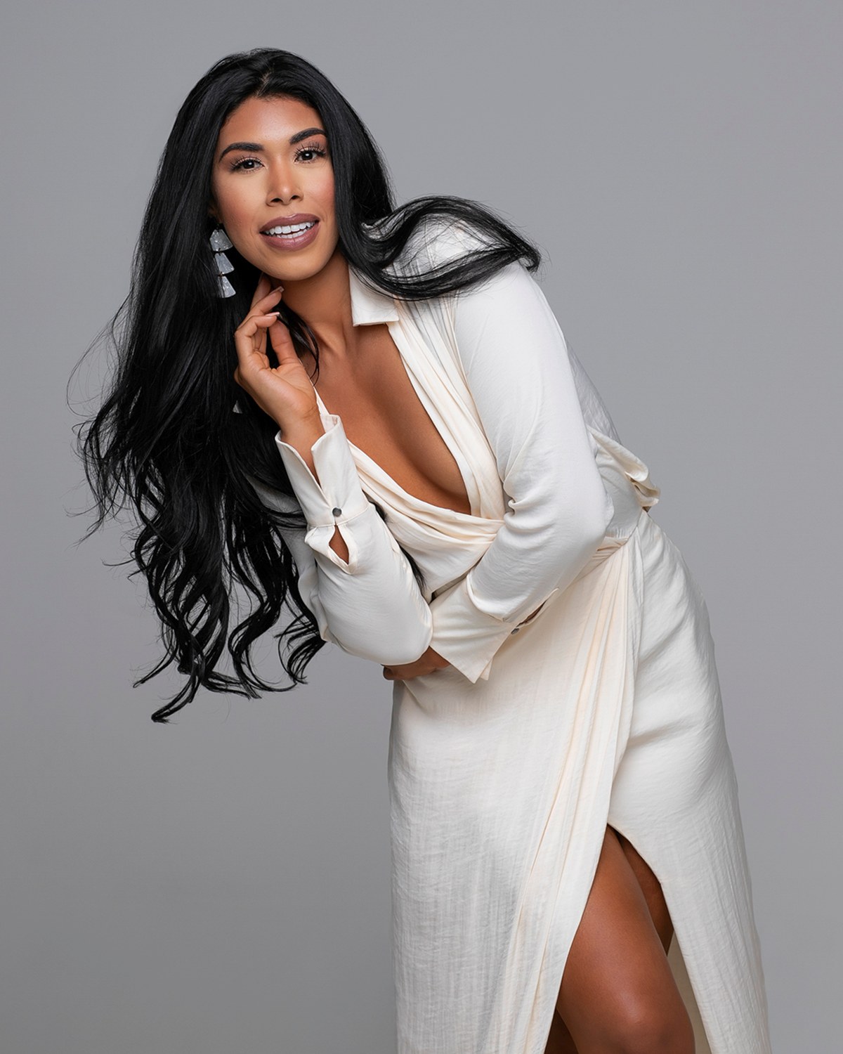
Fewer colors are genuinely wrong than the internet suggests. These are the ones that earn the warning.
One clarification, because it gets misread constantly. A color on this list is not banned from your life. If bright red is your signature and you feel unlike yourself without it, bring it, and bring one calmer option too. I photograph both, and you choose from the gallery. That is a better outcome than talking you out of the version of yourself you actually recognize.
A garment does not photograph in isolation. It photographs against whatever is behind you, and the relationship between the two is what creates separation, the sense that you are a person standing in front of something rather than a shape pasted onto it.
Dark clothing on a dark background can be gorgeous and moody, with your face carrying all of the light. It asks for careful lighting on the shoulders so the outline still reads. Light clothing on a light background is airy and modern and asks for the opposite discipline, keeping enough tone in the fabric that the picture does not go soft.
The combinations that go wrong are the near misses. A charcoal top on a mid grey backdrop, a navy jacket on a slate wall: close enough to look accidental, far enough apart to look like a mistake. Either commit to the match or leave real distance between them.
This is a good reason to say your color preference out loud when we plan. Backgrounds are a choice, not a fixed feature, so I can build the background around your clothes instead of asking your clothes to survive whatever is up. If your company has a palette, the same logic applies and there is a whole guide on dressing for your brand colors when the palette is the point.
The moment you are bringing more than one look, color stops being a single decision and becomes a small set that has to hang together. The images will sit next to each other on a page, in a gallery, in a lineup with colleagues, so they should look like one person on one occasion rather than a series of unrelated moods.
The simplest approach that works: choose one neutral base, one deeper accent and one lighter piece, all in the same temperature. Navy, burgundy and cream. Charcoal, deep teal and oatmeal. Camel, olive and ivory. Every combination inside those three will read as deliberate, and a jacket that goes over two of them multiplies the looks without adding a fourth color to manage.
For a personal brand library the same principle carries further, because the images are going to run in sequence on a website and in a feed. Variety comes from value and texture rather than from a rainbow: the same navy in a knit, a shirt and a jacket looks like range, while five different bright colors looks like a costume rack. How many looks to actually pack is settled in the guide on outfit changes.
Hair belongs in this palette too, since it is the largest block of color next to your face. Warm blonde and deep camel can blur together, and very dark hair on a black top can read as one continuous shape. There is more on that in hair styling for a portrait session.
You can predict almost all of this without a studio, and it takes about ten minutes.
Put on the candidate, stand facing a window in daylight with no overhead lamp, and have someone take a plain photograph of you from the chest up. Then judge the photograph rather than the memory of the mirror. You are checking three things: does your face still draw the eye first, is your skin a healthy color rather than tinted, and does the garment hold a clear shape or does it dissolve.
Run the same photograph past the neckline question while you are there, because color and shape are judged in the same instant and necklines that flatter the crop are the other half of the decision.
If two candidates survive that test, stop deliberating and bring both. Deciding in front of a mirror at midnight is how people end up wearing the thing they are least sure about. Deciding under studio light, with the camera on, takes one frame each. That is what a wardrobe consultation before the shoot is for: we plan your looks together, and the close calls get settled where they can actually be seen.
Color is the decision that causes the most second-guessing, and it is the fastest one to settle out loud. Say which two shades are in the bag and what the paper told you about your undertone, and I will choose the backdrop and the light around the one that behaves. Call (239) 319-6171 or send the form.
Book a Session Call (239) 319-6171Tell me a little about what you have in mind and I will be in touch personally. Pricing is personal, so the best way to plan is a quick call.
Share a few details and Annie will be in touch personally.