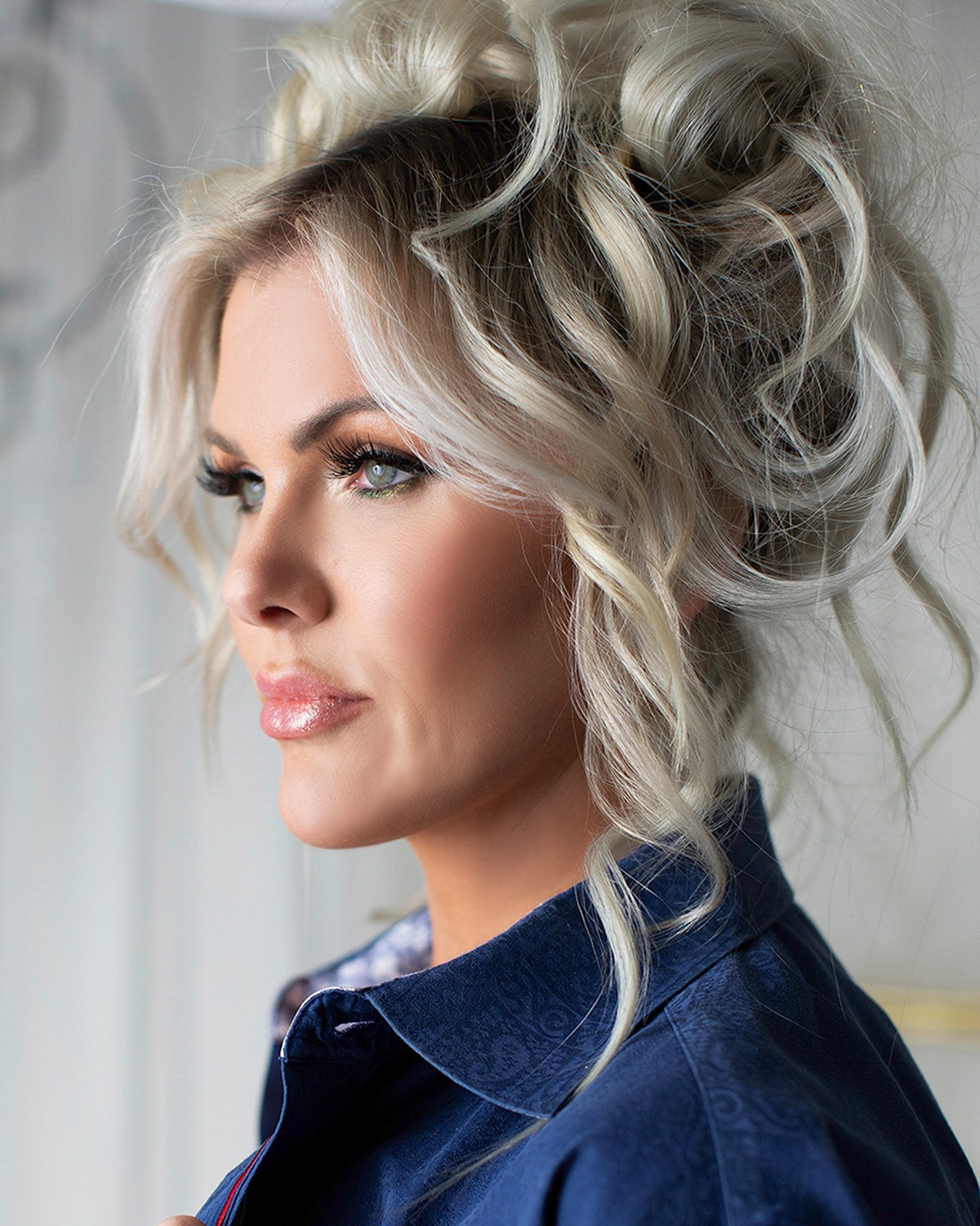
A pattern that looks sharp in a mirror can shimmer, blur or simply overpower a face once a camera and a screen get involved. This is the actual mechanism behind that, not a style opinion, plus a way to test any garment you own before a session using nothing but your phone.

Fine, tight patterns, narrow stripes, small checks, houndstooth, can create a rippling or shimmering effect on camera called moire, which happens when the pattern's fine lines interact with the sensor's own grid. It cannot always be fixed afterward, which is why it is worth avoiding at the source rather than hoping it will not show up.
Solid colors and larger, quieter patterns do not have this problem and leave your face as the clear subject of the frame. Pattern is not banned outright: it simply has to be big enough, and calm enough, to survive being reduced to a small still image.
Every camera sensor is built from a fine grid of light-sensing points. A fine pattern in clothing, a narrow stripe, a small check, a tight herringbone weave, is also a grid, just a fabric one. When two grids of a similar fine scale overlap, they can interfere with each other the way two screen doors laid on top of one another create a shimmering pattern neither door has on its own.
The result on camera is a rippling, colorful shimmer across the fabric that was never actually in the garment. It moves slightly if you turn or breathe, and it genuinely was not visible to the eye standing there. That is what separates moire from an ordinary style objection: it is not a matter of taste, it is an optical effect that shows up specifically because of how a sensor and a fine pattern interact.
It is also unpredictable. The exact stripe width, the fabric's weave, the distance from the camera and even the exact angle of a garment can all change whether moire appears or how strong it is. That unpredictability, more than the effect itself, is the real argument for choosing a safer pattern scale before the day rather than hoping a particular shirt behaves.
A solid color has no fine internal structure for a sensor to interact with, so it does not produce moire. That is the entire reason solids are the reliable default for a headshot: not because pattern is wrong, but because a solid removes an entire category of risk without you having to think about it again.
Solids also age well. A patterned shirt can look distinctly of a particular year in a way a well-chosen solid color rarely does, which matters for a photograph you may be using for a long stretch of time. And a solid leaves the maximum amount of visual room for your face, which is the actual subject of the photograph, to be the thing a viewer's eye lands on first.
None of this means every solid is safe. A very bright solid or one that matches the background exactly creates its own problems, covered fully in the what to wear guide's section on color, part of the planning that goes into every headshots session before the shutter ever clicks.
Pattern is not off the table. It spends attention, and some situations can afford the spend.
The common thread across every pattern that works is scale: big enough that the camera reads it as a deliberate design rather than a fine grid fighting its own sensor.
You do not need a photography background to check whether a garment is safe. A phone camera does a reasonable job of previewing the same effect a professional camera will show, because the underlying mechanism, a fine pattern against a fine sensor grid, is similar in both.
This same test works for the finer question of whether a pattern that looks borderline on a hanger will actually cause trouble on you, since fabric drape, your own movement and body shape all change how a pattern sits. Five minutes with a phone the week before a session settles a debate that would otherwise only get answered on the day.
A visible logo behaves like a pattern in one specific way: it pulls the eye to a spot on your clothing rather than your face, even when it is small.
The broad case against logos, that they date a photograph and tie it to one employer, and the habit of pairing a branded look with an unbranded one, is made in the what to wear guide. The deeper question is where a logo sits and how big it is, because that decides whether it reads as a detail or a destination.
A small woven brand mark, a subtle stitched detail, or a logo on a lapel pin rather than across the chest, causes far less trouble than a large printed one, for the same reason a large plaid causes less trouble than a fine check: scale and placement decide whether the eye notices it as decoration or stops there entirely.
Pattern is one of several wardrobe decisions, and it interacts with the others rather than standing entirely alone. A pattern in a color that clashes with your skin tone compounds the problem twice over, while a quiet pattern in a flattering color can be nearly invisible as a pattern at all once it is on you.
Color choice generally is its own full argument, covered in best colors to wear for photos. And the fabric a pattern is printed or woven into changes how it behaves under studio light just as much as the pattern's scale does, a shiny fabric with a fine pattern is nearly always the worst combination possible, which is explained fully in flattering fabrics on camera.
Together, color, fabric and pattern make up most of what a wardrobe consultation before a session actually settles, alongside fit and layering, in the full what to wear overview.
If you are choosing between two garments the morning of a session, this order settles most cases quickly.
For anyone wondering how this shifts once fit and tailoring come into it too, since a pattern on a poorly fitting garment fails for two reasons at once, that combination is covered in fit and tailoring on camera, and how it interacts with wardrobe suited to a specific age or stage of life is in what to wear over forty.
If a favorite shirt has a pattern you are unsure about, run the phone test at home first, and bring a solid backup regardless. Call (239) 319-6171 or send the form and describe the pattern, and I will tell you honestly whether it is worth the risk.
Book a Session Call (239) 319-6171Tell me a little about what you have in mind and I will be in touch personally. Pricing is personal, so the best way to plan is a quick call.
Share a few details and Annie will be in touch personally.