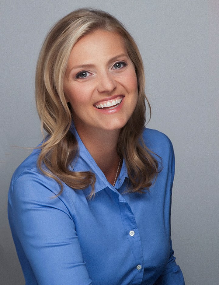
Every field has habits about what a professional photograph looks like. Nobody wrote them down and nobody enforces them, but they are real, and you can see them in about ten seconds by opening any bio page in that field. Knowing them is useful. Obeying them without asking why is not.

Industry conventions in headshots are patterns, not rules. What you will commonly see is a field's habit about three things: how formal the wardrobe is, how dark and how plain the background is, and how close the crop and how warm the expression are. Law and financial services pages tend to sit at the formal, darker, closer end. Health, hospitality and creative pages tend to sit lighter, warmer and looser.
The more useful question is narrower than the industry: what does the specific page your photograph is joining already look like? Convention is set by the layout you are landing in, and you can read that in a minute. Break it deliberately, in one direction at a time, when you have a reason you could say out loud.
It is tempting to describe this as a fact about the people in a field, as though everyone in banking shares a temperament and everyone in design shares another. That is not what is going on. What actually happens is that somebody built a page, chose a background and a crop, and then every photograph added afterwards was made to match it. A decade later that choice looks like an industry standard, when it was really one layout decision that nobody ever revisited.
This matters because it changes what you are complying with. You are not obeying your profession, you are fitting a grid and a set of neighbors. That is a smaller and far more reasonable thing to do, and much easier to decide when to stop doing.
The strongest convention in American professional life is actually one of absence. A resume here does not usually carry a photograph at all, which surprises people who trained elsewhere, and resume photo norms in the US covers why and what to do instead.
Whatever the field, the differences you are seeing come down to three adjustable things. Naming them turns a vague impression into something you can actually ask for.
How formal the clothing is, from a full suit and tie at one end to a plain knit at the other. This is the dial people notice first and the one they overthink most, which is why it has its own page: business casual or formal works through the decision properly, and what to wear for headshots handles the specifics of color, fabric and fit.
How plain, how dark and how contrasty the field behind you is. White reads clean and clinical. Light gray is the quiet default that disappears behind almost anything. Dark gray or black reads serious and adds weight. A textured or gradient background dates faster than a plain one.
How close the frame sits and how warm the face is. A tight crop with a full smile reads immediate and approachable. A wider frame with a level, even expression reads composed. Most fields have a habit here, and it is the dial that carries the most meaning while getting the least attention.
These are observations, not instructions. Every one of them has well-photographed exceptions, and the exceptions are often the people you notice.
If your own field is not on that list, open three pages where your photograph will actually appear and read those instead.
The version of this question people ask most is a binary one: corporate or startup, buttoned-up or relaxed. It is a false split, and holding it costs you accuracy.
Consider a single company. There is an investor page where the leadership photographs are formal, dark and closely cropped. There is a careers page, often on the same site, where the photographs are light, warm and loose, because the job of that page is to look like somewhere you would want to work. There is a support directory where the crop is tight and the background is white. Same company, same building, three registers. Nobody is confused by that.
So the honest advice is not "pick your camp". It is: decide where on the dial this particular use sits, and then hold the rest of the frame steady. Wardrobe is planned together beforehand for exactly that reason: one sitting can be built to land at two points on the dial rather than committing you to one.
The exception worth respecting: a page where every neighbor sits at one end. A grid of formal photographs with one relaxed picture in it does not read as personality. It reads as a photograph taken on a different occasion for a different reason.
This is the practical replacement for guessing. Take the page your photograph is going to live on, and answer these five questions off the screen in front of you:
That is a specification. Bring it to the sitting and the guesswork disappears, because backgrounds, crop and orientation are all decisions made at the time rather than repairs made afterwards. If the answer is that the set is a mess of different vintages and backgrounds, do not match the mess: match the best photograph in it, or the row the leadership sits in.
The same reading works for any destination, not just a team page. A speaker listing, a directory or a printed program each has its own habits, frequently stricter than the industry as a whole. Business headshots covers the everyday version of this, and the complete guide to professional headshots covers what a sitting can produce for the more demanding ones.
There are three good reasons to depart from what a field does, and one bad one.
If what you sell is that you are not like the others in the grid, a photograph that looks exactly like theirs argues against you. That applies to anyone whose positioning is that they are easier to deal with than the row they sit in.
Conventions are easiest to change at the moment the layout changes. If the site is being redesigned or the set is being re-photographed, the question is genuinely open, and someone should ask it.
A very dark, very formal photograph on a page that is trying to feel accessible is not a safe choice, it is the wrong one, however conventional it looks.
The bad reason is boredom. "I wanted something different" produces photographs that are different in three directions at once and therefore read as unplanned. The technique is to move one dial and hold the other two. Keep the background and the crop the field expects, and let the expression be warmer. Or keep the wardrobe formal and the expression even, and let the background go lighter than the set. One deliberate departure reads as a choice. Three read as an accident.
Some things do not vary by field, and they are the things that actually decide whether a photograph works.
One newer question sits alongside these: whether a portrait was made in a camera at all. That is a mechanical difference rather than a stylistic one, since a generated face has no sitting behind it and no original frame to go back to, and it is worked through in AI and real photography.
Everything above is about fitting in intelligently. What gets people photographed well is simpler: someone directs the light, the angle and the expression, so the picture is made rather than caught. That is what a sitting is, and it is what the headshot sessions page shows.
The fastest planning call starts with the page your photograph has to live on: the grid, the directory, the program, the site being rebuilt. Tell me what the neighbors look like and where you want to sit against them, and the background, crop and wardrobe decisions follow from there. Call (239) 319-6171, or send the form and we can plan from the page itself.
Book a Session Call (239) 319-6171Tell me a little about what you have in mind and I will be in touch personally. Pricing is personal, so the best way to plan is a quick call.
Share a few details and Annie will be in touch personally.