Two shirts can be the same color and the same size and photograph completely differently, because fabric decides how light lands on you before the color or the fit ever get a vote. Here is what different fabrics actually do under studio light, and a simple test for anything already hanging in your closet.

Under studio light, finish decides more than color does: a matte surface lets light wrap around you evenly, while satin, sheen and some synthetics throw it back as a hot white patch. Fabric with some structure and weight holds a clean line, while very thin or clingy knits show every layer underneath and every fold a body makes when it sits or turns.
The two qualities that matter most are finish, matte versus shiny, and body, structured versus limp. A fabric that is matte and has a little weight to it is close to foolproof in almost any studio session.
Studio lights are bright, close and directional, which is different from the softer, more even light most people are used to seeing themselves in. A matte fabric absorbs and scatters that light gently across its surface, the same way it looks in a normal room, just brighter. A shiny fabric, satin, silk with a high sheen, some polyester blends, does the opposite: it bounces the light back in a hard, small, hot patch exactly where the light source sits, which shifts as you move and can blow out into pure white on camera.
That hot patch is the specific, avoidable problem with shine. It is not that shiny fabric looks bad to the eye standing in the room, it often looks lovely there, it is that a studio light finds the one angle where it reflects and turns that patch into a bright blank spot no amount of retouching restores detail to.
The safest fabrics for a headshot or a formal portrait are true matte: cotton, wool, most linens, brushed or matte synthetics, and knits without an added sheen. If a fabric catches your eye with a subtle shimmer when you move it under a lamp at home, assume a studio light will find that shimmer too, only bigger.
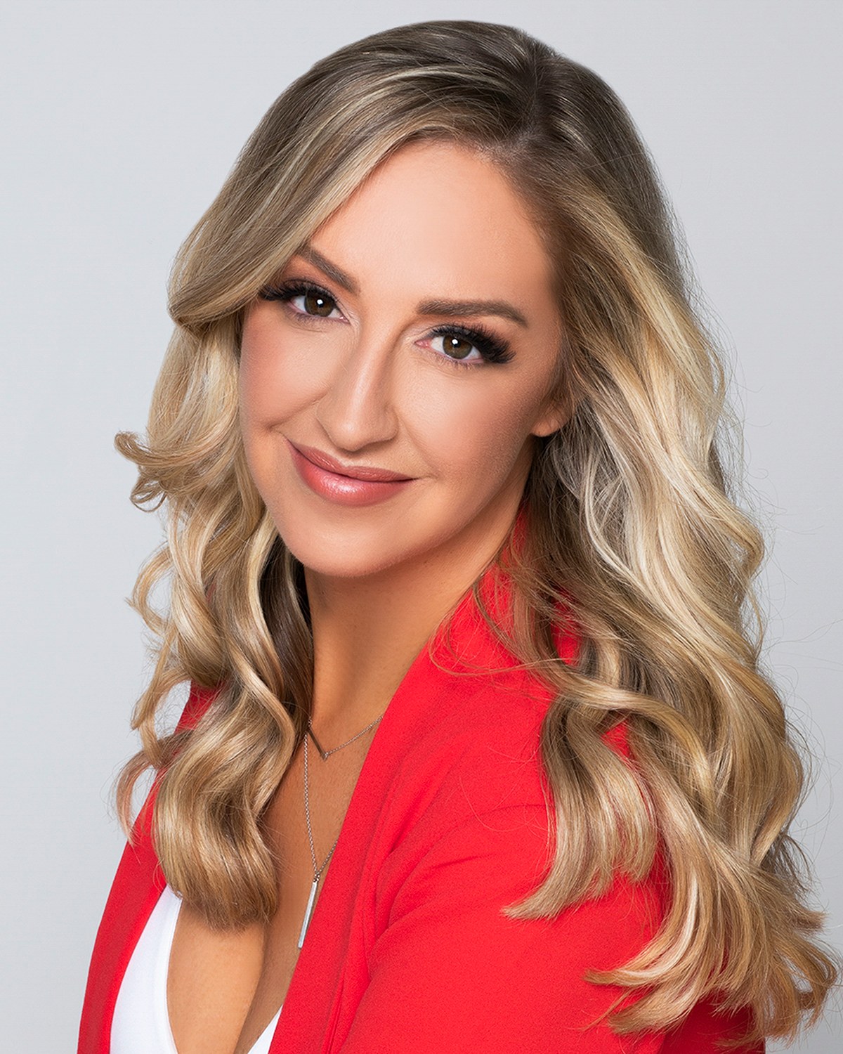
The second quality that matters is how a fabric holds its own shape, independent of color or shine.
This is one reason fit matters as much as fabric choice. A structured fabric cut too large adds bulk of its own, and a drapey fabric cut too tight clings in a way structure never does. The full picture on how cut and size interact with fabric is in fit and tailoring on camera.
Knits are the most common fabric people reach for because they are comfortable, and comfort matters in front of a camera. But knits vary enormously in how they photograph.
A knit with real weight and a tight, even stitch, a good sweater, a substantial jersey, holds its shape and reads as intentional. A thin, loose-knit fabric can be more revealing than intended, showing the outline of anything worn underneath, stretching unevenly across the shoulders, or clinging in a way that adds visible lines a stiffer fabric would not. The stretch that makes a thin knit comfortable to wear all day is the same stretch that makes it move unpredictably in front of a lens.
The simple check: pinch the fabric and let go. If it springs back to a flat, even surface, it will likely photograph well. If it stays slightly rippled or clings immediately to your hand, expect it to do the same thing on camera.
Linen photographs beautifully in its own right, breathable, matte, with a subtle texture that reads as natural rather than synthetic. Its one real complication is wrinkling, since linen creases more visibly, and more quickly, than almost any other common fabric, including from nothing more than sitting in a car or being folded into a bag.
The fix is entirely about timing, not avoidance. Press linen right before wearing it, hang it rather than folding it on the way in, and avoid sitting in it for long stretches immediately beforehand if you can help it. A crease that looked fine in the mirror at home can look considerably sharper once it is lit directly and magnified on a screen, so a last check right before the camera comes out is worth the extra minute.
If linen is central to your look and you are driving any real distance, consider a light layer over it for the drive and removing it just before we start, which keeps the fabric closer to how it looked the moment it was pressed.
Sheer or semi-sheer fabric behaves in a specific, predictable way under a bright studio light: the light passes through it more than a normal room's light does, which can reveal more of what is underneath than the fabric appears to show in ordinary daylight.
This is worth knowing in advance rather than discovering on camera. A sheer blouse or a thin, unlined fabric that looks perfectly opaque in a bedroom mirror can read differently once a strong light is aimed directly at it. If a piece is sheer or unclear, a simple slip or an underlayer solves it completely and is worth wearing as a matter of course rather than a fix applied after the fact.
This has nothing to do with modesty rules and everything to do with how light physically moves through thin material. It is the same reason a flashlight held behind a hand glows through it: strong, direct light finds thinness that softer light does not.
A headshot is often viewed small, a thumbnail, a profile photo, a card in a directory, which changes which textures are worth choosing.
Fine texture, a subtle weave, a soft nub, a gentle cable knit, tends to hold up at small size and can even add a sense of quality and depth that a completely flat fabric lacks. Very fine, tight texture close to the scale of a pattern can behave like one, occasionally producing the same rippling effect covered in prints and solids on camera, so if a texture reads almost like a pattern from a few feet away, treat it with the same caution.
The reliable middle ground is texture visible at arm's length but calm at a glance, exactly the kind that reads as a considered fabric choice rather than either a flat plain surface or a busy one.
Before a session, this quick check on any garment tells you most of what you need to know.
None of this replaces bringing a few honest options and deciding together once the light is actually on. But this test, done the night before while you are packing, catches most fabric surprises before they become a session-day surprise.
Fabric is one part of a larger decision that also includes color, fit and pattern, and the four interact more than any one alone. A matte fabric in the wrong color still needs the color fixed, and a perfectly cut jacket in a shiny fabric still fights the light. The complete decision, in the order it is worth working through, is in the what to wear guide, part of what every headshots session plans in advance. For the circle crop a profile photo uses, the same fabric rules apply and the crop-specific advice sits in what to wear for a LinkedIn photo.
For a wardrobe planned for a personal brand sitting (the planning itself is in what to wear for a personal brand shoot), fabric choice matters even more, since a wider frame and several looks in one session mean fabric texture and finish get seen at more distances and angles than a single tight headshot crop ever shows. And if you are choosing between two shirts that are otherwise identical except for a subtle pattern woven into the weave, that decision belongs to the prints vs solids guide rather than this one.
None of this needs to be solved alone. The wardrobe consultation before the shoot is where a fabric question like this gets answered.
Pinch it, tilt it under a lamp, hold it to the window. If a shirt passes all three, pack it. If it fails one and you love it anyway, tell me which one when we plan your looks and we will decide whether it earns a place in the sitting. Call (239) 319-6171 or send the form.
Book a Session Call (239) 319-6171Tell me a little about what you have in mind and I will be in touch personally. Pricing is personal, so the best way to plan is a quick call.
Share a few details and Annie will be in touch personally.