Portfolio
Headshots Boudoir Personal Brand
More
Guides Investment Guided Posing About Book a Session
Home  /  Guides  /  Photos for Podcasting
Career

Photos for podcasting: cover, guests, show pages.

Podcasting asks for pictures in shapes nothing else asks for. A square that has to work the size of a fingernail. A portrait a host can drop into a template beside their own. A wide frame with the show name written across it. One sitting can produce all of them, but only if somebody knows that going in.

By Annie Watson · Naples, Florida · Updated September 2026
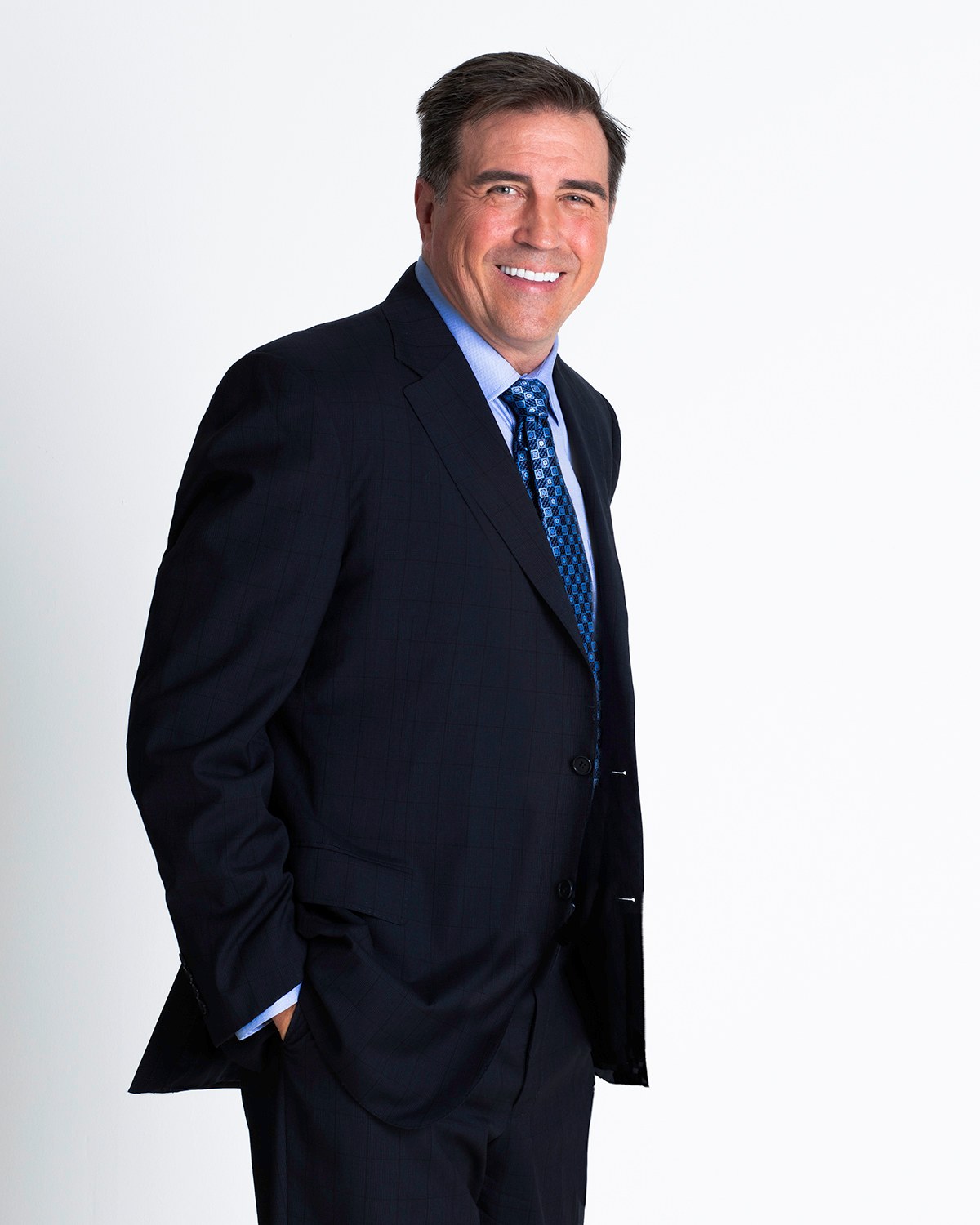
Man in a navy suit and patterned tie standing with hands in his pockets, white backdrop, photographed by Annie Watson in her Naples studio
The Short Answer

A show needs four pictures in three shapes. A square frame for cover art, where your face sits large and clean because the tile is displayed very small. A portrait a host can crop square or circular and drop straight into their template, on a plain background at full resolution. A horizontal frame for the show page or a player header. And frames with deliberate empty space, so a designer can put the show name and episode titles over them without covering your face.

This is studio portraiture, not a recording session. The pictures are of you, made in a private studio, and then cut to the shapes podcasting uses.

Four pictures, one sitting.

Whether you host, guest, or both, the requests are predictable. It is worth listing them before anything gets photographed, because the difference between owning all four and owning one is a planning conversation, not a second booking.

  • The square. Used for cover art and for almost every listing tile. Your face large, background simple, nothing important near the edges.
  • The drop-in portrait. Plain background, head and shoulders, croppable to a circle or a square without losing an ear. This is the file a host asks you for.
  • The horizontal. Wide, with you to one side, for a show page header, a player banner or an article about the show.
  • The copy-space frame. Any orientation, as long as one side or the top is empty enough to carry type.

Those are four crops and two or three setups, not four sessions. Backgrounds and wardrobe are planned together in advance, so a single sitting can move from a light background to a darker one and from a tight frame to a wide one on purpose. The general craft behind the frames is in the complete guide to professional headshots.

The square, and the tile it becomes.

Cover art is a square, and the square is the most brutal format in this list, because of where it is seen. On a phone, in a list of shows, it is roughly the size of a thumbnail. Whatever subtlety you put in it is gone at that size, and whatever is legible at that size is the whole design.

That has consequences for the photograph inside it:

  • Scale up. A face that reads at tile size is cropped closer than a face that reads on a page.
  • Contrast, not detail. Separation between you and the background survives the shrink. Texture does not.
  • Leave a zone for the title. The show name is going somewhere on that square, usually across the top or the bottom, and it needs a calm area to sit on. Photograph it that way instead of asking a designer to invent the space later.
  • Keep the edges quiet. Nothing meaningful within a comfortable margin of the border, because listings frequently round the corners.
  • One face is easier than two. Co-hosted shows want a frame with room to place two portraits, not two tight crops jammed together.

Cover art is supplied as a single large square that has to serve both sizes, the show page and the tile. That is a design question rather than a photography one, but it decides the frame: a portrait shot loose and square-friendly gives your designer room, and a tight vertical frame gives them a problem.

The guest photograph a host can actually use.

When you are booked on a show, you get a message asking for a photograph and a bio, usually with a short turnaround and no specification. What happens next decides how you appear in the episode art, the show notes and every post about the episode.

What a host's template almost always needs is the same four things: a plain, uncluttered background, a crop that survives being cut to a circle or a square, enough resolution to be used larger than expected, and a file that is not a screenshot of a profile picture. Send a horizontal option as well, unasked, and you have solved a problem the host did not have time to describe.

Two small habits that make you the easy guest:

  • Name the file with your own name rather than a string of camera digits, so it does not get lost in a folder of twenty attachments.
  • Send one clear choice with one alternate, not a gallery. A host choosing between fifteen images will choose slowly, or choose the wrong one.

A guest slot is a first impression made before you speak, which is the same job a photograph does on an application, and headshots for job seekers covers that version of the problem. If the picture you would send today is the one you have been meaning to replace, how often a headshot needs refreshing is the short version of that decision.

The horizontal frame for the show page.

Almost everything that is not the cover tile is wide. A show page header, a player banner, an episode graphic, a post announcing a guest: all of them want a frame considerably wider than it is tall, usually in the neighborhood of the familiar sixteen-by-nine shape.

A wide frame is not a square with the sides cut off. It has to be composed as a wide frame, which means you sit off-center by design, the background carries the rest of the width, and the empty side is intentional rather than accidental. Crop a tight portrait to that shape and you get a letterbox slice across your eyes.

This is also where a plain studio background earns its place. An even, uninterrupted field can be extended and worked over by a designer without anybody noticing the seam. A busy background cannot, and every graphic built on it has to work around what is already there.

The vertical version of the same problem shows up in stories and short posts, where the frame is much taller than it is wide. Both come out of the same sitting when you name them beforehand, and social media portraits is the session built around that whole family of shapes.

Copy space is the whole trick.

If you take one idea from this page, take this one. Almost every picture podcasting uses will have words on top of it: the show name, an episode title, a guest name, a pull quote. The most common reason a good photograph cannot be used is that there is nowhere to put the words.

Copy space is not leftover room. It is composed on purpose:

  • Sit to one side of the frame and leave the other side genuinely empty.
  • Keep the empty side even in tone, so type stays legible across all of it.
  • Mind the contrast. Light type needs a darker area to sit on, dark type needs a lighter one, and a mid-gray background is the hardest surface to write on.
  • Leave headroom in at least one frame, for the shows that put the title across the top.
  • Shoot the same look tight and wide, so the same wardrobe and light give you a portrait and a banner.

None of that is exotic. It is a decision made at the time about where you stand and how much of the room is in the frame, and it costs nothing extra to plan. It is much harder to fake afterwards, which is why designers ask for it and are so often handed a tightly cropped headshot instead. The same thinking, applied to posts rather than players, is covered in poses for social media photos.

What this is, and what it is not.

Worth being direct about. These are portraits made in a private studio: several backdrops, room to change between looks, and someone directing the angle, the light and the expression. They are not photographs of you recording, and there is no staged setup with equipment in the frame.

That is a feature rather than a limitation. Pictures of somebody wearing headphones in front of a microphone date quickly, describe the format rather than the person, and look identical across every show that uses them. A clean portrait with room around it can be rebuilt into cover art, an episode graphic, a banner and a listing, and it still works when the show changes its look next year.

Podcasting is also rarely the only thing these pictures do. The same set of frames feeds a speaker listing, a site, a newsletter header and an article about you, which is the argument for treating it as a library rather than as one asset. Personal brand sessions are built that way, and the personal brand photography guide explains how the shot list gets planned before anyone picks up a camera.

The kit to keep, and how to send it.

When the gallery arrives within the week, do one small piece of work and the next request stops being a scramble. Build a folder with four files in it: one square, one horizontal, one vertical, and one plain-background portrait cropped tight enough for a circle.

Keep a large version of each, and export a smaller one beside it for quick sending. Name them plainly, with your name and the shape, so the right one can be found by somebody who is not you. Then keep a short line of text in the same folder: your name as you want it written, and how it is pronounced if it is ever said wrong.

When a request arrives, reply with the folder, or with the two files that match what the show uses. The whole exchange takes a minute and it is the difference between appearing the way you intended and appearing however a host's search results decided. If a picture is heading for print as well, for a program or a poster, print sizes and cropping covers what that asks of the file.

Key Takeaways
  • Podcasting needs four pictures in three shapes: a square for cover art, a drop-in portrait for hosts, a horizontal frame, and something with room for type.
  • Cover art is judged at tile size, so crop closer, favor contrast over detail, and leave a calm area for the show name.
  • The guest photograph hosts want is plain-background, croppable to a circle, at full resolution, and named after you.
  • Wide frames must be composed wide, with you off-center and the empty side intentional, not cropped out of a tight portrait.
  • Copy space is the single most useful thing to plan for, and the hardest thing to add afterwards.
  • This is studio portraiture rather than a recording session, which is precisely why the pictures outlive any one show's look.
Next Step

Before the first episode drops.

If you are launching a show, or you keep being asked for a guest photograph and keep sending the same tired file, tell me the shapes you need: the square, the wide banner, the drop-in portrait. We can plan the looks and the copy space around them before anything is photographed. Call (239) 319-6171, or send the form; it comes straight to me.

Book a Session Call (239) 319-6171
Put It to Work

Sessions this guide points to.

Good to Know

Questions, answered.

What size should the photograph behind my cover art be?
Cover art is conventionally supplied as a large square, commonly 3000 pixels on a side, so it holds up displayed large on a show page and shrunk to a tile in a list. A properly made portrait file has the pixels for that. What it often does not have is the composition, since a square cut out of a tight vertical frame crops the head badly and leaves nowhere for the show name, so the square is worth framing on purpose at the sitting.
A host asked for a square headshot. What do they actually mean?
They mean a picture that will not break when their template crops it to a square or a circle beside the host's own. In practice: plain background, head and shoulders, centered enough that nothing important is near an edge, at full resolution rather than downloaded from a profile. Send a horizontal option too, because their episode graphic probably needs one.
Can I use the same photograph for the cover and for my guest appearances?
It is better if you do not. Cover art is your show's identity and tends to be styled with the title over it; a guest photograph is you as an individual, dropped into somebody else's design. Using one file for both means either the cover is bare or the guest picture arrives with your show name printed across it. They come from one sitting, but they should be different frames.
Do I need a picture with a microphone in it?
No, and it usually works against you. Equipment in a portrait dates the picture, describes the format rather than the person, and looks the same across every show that uses it. A clean portrait with space around it can be built into cover art, an episode graphic and a banner, and it will still be usable when the show's look changes.
I host my own show and guest on others. Different photographs for each?
Different frames, one look. Hosting a show and appearing on somebody else's are two different rooms, but you want to be recognizably one person in both, so keep the light and the wardrobe register consistent and let the crops and the backgrounds vary. That is exactly what planning several looks in one sitting is for.
Does the photograph need to match the show's look?
It does not, and trying is a trap. The palette, the type and the graphic style belong to the cover design, and they get redrawn whenever the show is refreshed. A portrait built to match this year's look has to be remade with it. Keep the background plain and the light clean, let the graphics carry the identity, and the same frames survive the next redesign.
Book Your Session

Your best headshot is one session away.

Tell me a little about what you have in mind and I will be in touch personally. Pricing is personal, so the best way to plan is a quick call.

Studio
5400 Yahl St, Naples FL

Prefer to talk? Call (239) 319-6171. I respond personally.