Portfolio
Headshots Boudoir Personal Brand
More
Guides Investment Guided Posing About Book a Session
Home  /  Guides  /  White, Grey or Black
Knowledge

White, gray or black behind you.

The background is the second largest thing in a portrait after your face, and it is usually the decision people spend the least thought on. Here is what each of the three neutrals actually does to a picture, what each one demands in return, and how to pick based on where the photograph is going to live.

By Annie Watson · Naples, Florida · Updated September 2026
Woman with blonde hair in a purple sweater, hand on hip, gray backdrop, photographed by Annie Watson in her Naples studio
The Short Answer

White gives a clean, open frame that drops neatly into bright layouts, and it has to be lit separately to stay white rather than turning gray. Gray is the flexible one, because a single mid gray surface can be rendered anywhere from near white to near black by changing how much light reaches it. Black gives weight and drama, and it requires deliberate separation so that dark hair and dark clothing do not dissolve into it.

The choice is decided by where the picture will sit and what you are wearing, not by what any color is supposed to mean.

The background is a lighting decision.

Start with the thing that surprises people: the color you see behind a subject is not simply the color of the surface. One mid gray backdrop can be rendered as a clean white, a soft light gray, a deep charcoal or a near black, and nothing about the surface has changed. What changed is how much light reached it.

Two controls do the work. The first is light aimed at the background itself, which raises its tone. The second is distance, because light falls off sharply as it travels, so a subject standing well forward can be correctly lit while the surface behind them receives almost nothing and goes dark.

This matters to you for one practical reason. When you ask for a particular background, you are describing a rendered tone rather than a piece of material, and the way to get it is to say what you want the picture to look like. The mechanics of that live in the guide to studio lighting styles, and they are the reason the same room produces backgrounds that look nothing alike.

White, and what it costs to keep.

A true white background is the most demanding of the three, which is the opposite of what most people assume. Left alone it renders as a dull gray, so it has to be lit to a brighter level than the subject to read as white at all.

Do that carelessly and it fights back. Light bouncing off a bright surface behind you comes forward and lands on your shoulders and the back of your hair, lifting contrast and softening the edge where you meet the background. Push it further and the edge stops existing: light hair, a white collar or a pale jacket simply merge into the frame.

Done properly it is genuinely useful. A clean white frame sits well in a bright page layout, it can be extended by a designer who needs a wider crop, and it reads current and uncluttered. It suits directory listings, press pages, anything printed on white paper, and any row of portraits where the surrounding page is already light.

The wardrobe rule follows directly: on white, wear something with tone to it. A dark jacket over a light shirt gives the frame an anchor. An all-pale outfit on white leaves a floating head, which is exactly the trap covered in the guide to wearing black or white in photos.
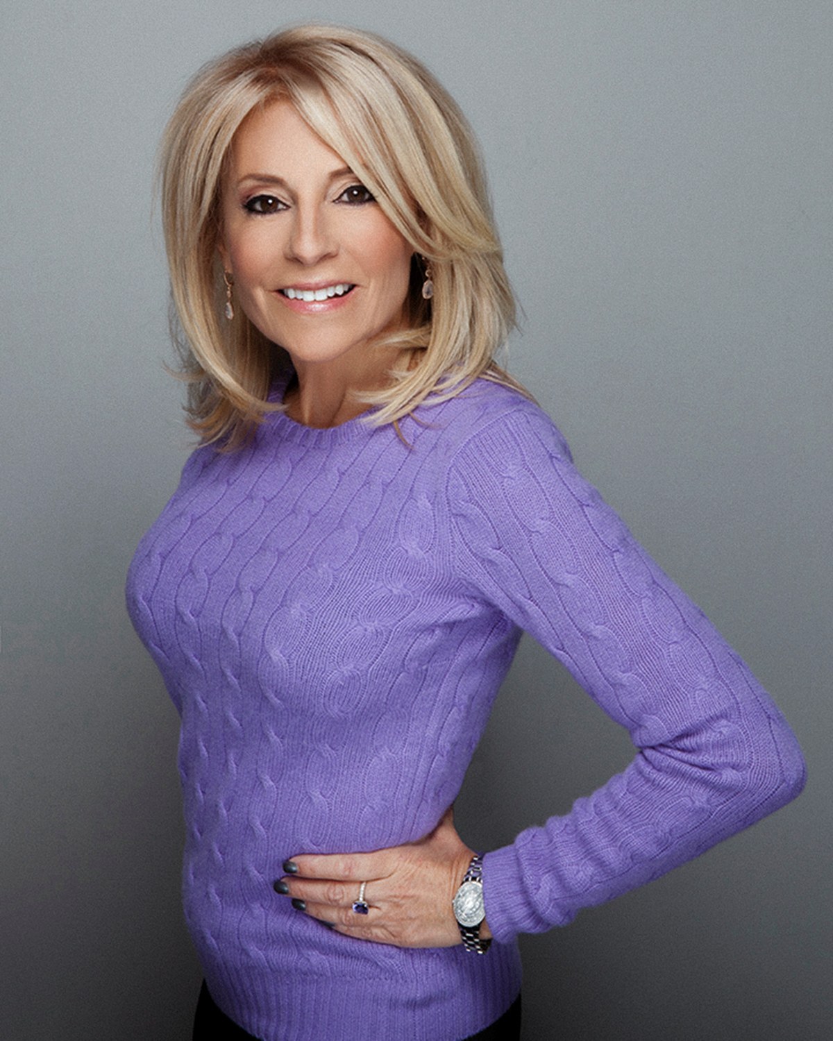
Gray, and why it is the one to beat.

Gray is the default of professional portraiture for an unromantic reason: it is the only neutral that works with every hair color, every skin tone and every wardrobe without special handling.

It also has range that the other two do not. Lit up, it approaches white and reads open. Lit down, it approaches black and reads serious. Lit from one side or with a small pool of light behind the head, it produces a gradient, brighter behind you and falling off toward the corners, which is the look most people picture when they think of a well-made business portrait.

Practically, that means a mid gray surface can produce several different backgrounds in a single sitting without changing anything but the light, which is a real advantage when your pictures have more than one job to do. A profile picture and a formal portrait can come from the same setup and still look like deliberate, separate choices.

If you are unsure, gray is the answer that almost never gets regretted, and it is the safest option to standardize on when you are archiving your photos and expect to be adding matching images to the same folder in future years.

Black, and the separation problem.

Black is the most decisive of the three and the least forgiving. It removes every distraction and puts all the tonal weight on your face, which is why it suits press portraits, leadership pages, author photographs and anything meant to be printed large.

The problem is edges. Dark hair against black has nothing to separate it from, and neither does a navy suit or a black jacket, so the shoulders and the top of the head vanish and what remains is a face with no body attached. The craft solution is an edge: a light placed behind and to one side that traces a rim along the hair and shoulder, or a background allowed to sit a shade above true black so there is still a boundary.

That is a solvable problem, and it is worth knowing it exists because it separates a considered black background portrait from one where the photographer simply turned the background light off. It is also one of the quieter differences behind why professional work beats a phone photo: a phone rendering a dark background has nothing available to draw that edge with.

Black is not the same decision as a monochrome photograph, though the two get confused constantly. When to convert an image to grayscale is a separate question, answered in the guide to black and white portraits.

Matching your outfit to the wall behind you.

The mistake almost everybody makes is treating the background as decor and coordinating it with your clothes. It is not decor. It is contrast, and its job is to make you a distinct shape on a page.

The working rule is contrast at the shoulders, because the shoulders are where you and the background meet.

  • Dark jacket, dark hair: choose a lighter background so the outline of your shoulders and head is unmistakable.
  • Light or white top with no jacket: choose a mid or darker background so the picture has an edge to hold on to.
  • Light hair: avoid a bright white background unless there is a deliberate edge light, or the hair loses its outline.
  • A patterned or high contrast outfit: choose the plainest background available, because two busy elements in one small frame compete.

None of this is about mood or symbolism. It is about whether a stranger can read your outline instantly at the size the photograph will actually be seen, which is often a circle the width of a fingernail.

The crop changes the answer.

How tight the frame is decides how much background there is to notice, and that changes which choice is right.

In a tight head and shoulders crop the background is a flat field of tone in the corners of the frame, and gradients barely register. Almost anything works, so the decision is really about contrast at the shoulders and about matching whatever else is on the page.

In a three quarter or full length frame the background becomes a wall. Falloff, the seam where the surface meets the floor, and any gradient are all clearly visible, and a plain flat tone can start to feel like nothing at all. That is where gray with a deliberate gradient does its best work.

It also affects what a designer can do later. A background with a gradient is difficult to extend cleanly, so if the picture is heading for a banner or a page hero that needs empty space beside your head, an even tone is the practical choice. That is worth saying out loud before the sitting, along with everything else in the guide to professional headshots.

Choosing by where the picture lands.

Work backwards from the destination and the decision usually makes itself.

  • A profile photograph shown as a small circle: a mid tone that separates cleanly, since detail in the background is invisible at that size anyway. The rest of that decision sits in my guidance for LinkedIn headshots.
  • A firm bio or directory row: match the tone your colleagues were photographed on before anything else.
  • A press or speaking profile: darker, with an edge light, because it holds attention against a busy page.
  • A printed program or a white page layout: light gray or white, so the picture does not sit on the page as a heavy rectangle.
  • A website hero or a banner: an even tone with room beside your head for text.

If your photographs have several destinations, the sensible move is more than one background in the same sitting rather than a compromise that suits nothing exactly. Several backgrounds and wardrobe changes are planned into a single sitting for exactly that reason, and my headshots page is the easiest way to see what the difference between them looks like. It is also why I work against placed backdrops in a controlled studio rather than against whatever wall is available.

Key Takeaways
  • The tone you see behind a subject is made by light and distance, so one gray surface can render as white, gray or black.
  • White has to be lit brighter than you are to stay white, and it spills light forward onto your shoulders and hair.
  • Gray is the flexible neutral: it can be raised, lowered or graded, and it works with every hair color and wardrobe.
  • Black concentrates attention on the face and needs a deliberate edge, or dark hair and dark clothing disappear into it.
  • Contrast at the shoulders is the working rule, so the background should differ in tone from what you are wearing.
  • A tight crop makes the background a field of tone, while a wider frame makes it a wall with visible falloff and seams.
Next Step

Tell me where the picture is going.

The background is decided by the destination and by what you are wearing, which is why it belongs in the planning conversation rather than in the first ten seconds of a sitting. Tell me where the photographs will live and we plan your looks and backgrounds together. Planning and pricing are personal, so start with a quick call to (239) 319-6171 or the form.

Book a Session Call (239) 319-6171
Put It to Work

Sessions this guide points to.

Good to Know

Questions, answered.

Can I have more than one background in one sitting?
Yes, and it is usually the right call when your photographs have more than one job. Several backgrounds and wardrobe changes are planned into a single sitting, so a lighter, open frame for a profile and a darker, weightier one for a bio can both come out of the same visit. Deciding which ones in advance is what the wardrobe consultation is for.
Will a white background make me look washed out?
It can, and the cause is light bouncing off the bright surface behind you and coming forward onto your shoulders and hair. That lifts the shadow side and softens your outline. The fix is separation: enough distance between you and the background, and a key light shaped for your face rather than for the wall. Wearing something with real tone in it also helps considerably.
Our team photographs are all on gray. Can a new one match?
Usually, if you can show me one of the existing pictures. Three things need to line up: the tone of the background, whether it is even or graded, and the direction of the light on the face. Team members are photographed in the studio in sequence for that reason, so the row reads as one set rather than a collection.
Is a colored or textured background ever the right choice?
For brand work it can be, when the color is doing a specific job such as tying a set of images to a palette you already use elsewhere. For a business portrait that has to sit beside other people's photographs, a neutral is nearly always the safer answer, because a strong color dates faster and limits where the picture can be placed. Bring it up on the call and we can talk through what would suit the pictures you need.
Does the background still matter in a tight crop?
Less than you would think in terms of detail, and just as much in terms of tone. At a small size nobody sees a gradient or a seam, but they absolutely see whether your shoulders separate from what is behind them. So in a tight crop the whole decision collapses into one question: does this tone contrast with my hair and my clothing.
Should the background be blurred?
On a plain backdrop there is nothing to blur, because there is no detail to lose. Softening it slightly can help the tone look smooth and even, but heavy blur on a plain surface buys you nothing and can leave a halo along your shoulders. Background blur earns its keep when there is something behind you worth removing attention from, which is the subject of the guide to depth of field.
Book Your Session

Your best headshot is one session away.

Tell me a little about what you have in mind and I will be in touch personally. Pricing is personal, so the best way to plan is a quick call.

Studio
5400 Yahl St, Naples FL

Prefer to talk? Call (239) 319-6171. I respond personally.