The phrase gets used for landscapes, for anything in black and white, for a pale washed-out editing style, and often as a label attached after the fact. None of those are what it means. It is a claim about why a photograph was made and what the finished object is.

A photograph is fine art when it was made because the photographer wanted that photograph to exist, and when the finished print is the work rather than a copy of it. It is a statement about intent and about the object, not about subject matter. Landscapes are not automatically fine art and portraits are not automatically excluded.
The useful contrast is with the two other reasons pictures get made. A commercial photograph serves a brief: it has to sell, inform or represent something. A documentary photograph serves a fact. A fine art photograph serves the picture, and it is judged on whether it holds your attention rather than on whether it did a job.
Nothing about the content of a frame makes it fine art. A dune, a face and a bowl of fruit are subjects, and every one of them has been photographed as art, as advertising and as a record. What separates the three is the question the photographer was answering when they pressed the shutter.
A commercial brief asks whether this makes the thing look good at the size it has to work at. A documentary brief asks whether it is true and clear. An art brief asks something less comfortable: whether the picture is worth looking at when nothing else is riding on it.
The same photograph can therefore change category depending on why it exists. A portrait made to sit on a website is functional, and it should be. The identical frame, printed large because you want to live with it, is not doing that job any more, and the difference is not a marketing flourish. It changes what gets chosen, how it is finished and how big it is made.
There is a looser use of the phrase worth setting aside. In parts of the portrait market, fine art has come to describe a look: pale, airy, low contrast, faintly film-like. That is a style, and a style can be applied to a photograph made for any reason at all, which is exactly why it cannot be what the term means.
This is the part almost nobody has had explained, and it changes how the whole thing works.
In fine art photography the print is the artwork. The file is closer to what a negative used to be: the raw material the object is made from. That is a different relationship from the one you have with a photograph on a screen, where a print is a nice reproduction of the real thing.
Once the print is the work, a set of decisions moves inside the art instead of sitting outside it as fulfilment:
So a file can be a good photograph and a bad print, and the two failures are unrelated. It is also why a photographer working this way talks about the print for as long as about the session. What each surface does to an image is set out in my comparison of canvas, metal or paper prints.
None of this makes the file irrelevant. It makes it a separate question, with its own answers, on my note about digital files.
You will see prints described as a limited edition, often with a fraction in pencil in the margin. Here is what that is.
A limited edition means the artist has stated that a set number of prints will be made at a given size, and that no more will follow. The fraction is the position in the run. An artist proof sits outside the numbered run. An open edition means no limit exists.
Be clear about what that does and does not do. It does not improve the photograph. It is a market convention, invented because the art trade needs scarcity and provenance in order to price something that can be reproduced perfectly and endlessly. It is a promise about the future, not a fact about the picture.
It is not empty, either. A stated edition is a commitment, and a signature is a maker saying this one passed. In a portrait context, where the print is usually for you rather than for a market, it mostly functions as a way of treating a picture as an object worth taking seriously. Whether a particular photographer editions or signs their work is a question for them.
One more term you will meet: giclee, which sounds grand and means a pigment inkjet print on good paper. It is how fine art photographic prints are made now, and on its own it tells you almost nothing.
A single strong photograph is a picture. A group made under a shared constraint is an argument, and that is where the phrase starts to earn itself.
The mechanism is simple. Fix something and repeat it: one light, one background, one gesture, one distance. Because the constraint does not move, everything that does becomes the content. Ten portraits made identically stop being ten portraits and become a study of the difference between ten people.
It also explains why sequence matters once the work is printed or bound. Order and pacing carry meaning in a set in a way they never do in a folder, which is why a book behaves differently from a gallery, argued on my page about albums and heirloom books.
Sharpness, correct exposure, accurate color and ample resolution are the floor. They are how a picture avoids being wrong. They are not how it becomes worth looking at, and confusing the two is the commonest mistake people make in judging photographs.
A flawlessly executed frame of nothing in particular is a good record and a dull picture. Plenty of photographs people have kept looking at for a long time are grainy, or slightly soft, or so dark that most of the information is simply gone. They survive because something in the frame holds you.
There is a decent test for any portrait, including one of yourself. Would this still hold you if the person in it were a stranger. Portraits that pass tend to share one thing: the light is doing something specific, and enough has been taken out of the frame that what is left has nowhere to hide.
The reverse test is about time. A picture built on a current grading style or a fashionable filter is carried by the trend rather than by itself, so it ages at the speed the trend does. Restraint is not a moral position. It is why plain, hard-lit work made long ago still looks like it was made yesterday.
In my own work this is a decision taken in advance rather than a finish applied later. Fine art work, black and white included, is part of my published gallery, and the direction governs how the room is lit.
In practice it means harder, more directional light, deep shadow left alone rather than filled, a plain ground, and a deliberately narrow edit. A picture with a job to do wants light that is soft and even. This wants the opposite, because here the shadow is not a byproduct of the lighting, it is half of the composition. The plain version of that vocabulary is in my guide to studio lighting styles.
It also means monochrome is decided beforehand rather than applied afterward, because shooting for black and white changes how hard I light and how far the shadow is allowed to fall. That decision has a functional cousin, which is when a working portrait should be monochrome, and I keep it separate on my note about black and white headshots.
The studio matters here more than anywhere, because control over light is the medium rather than a convenience. That argument is on my page about working in a studio rather than wherever the light happens to be.
The clearest published example is my fine art boudoir work, where the brief is the image itself rather than an occasion. The black and white frames in the boudoir gallery are the shortest way to see whether it is the direction you mean.
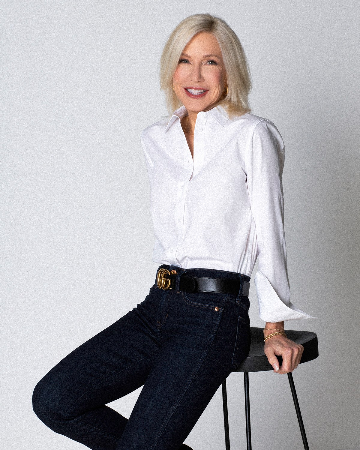
If you want a photograph of yourself made this way rather than a portrait that performs a function, four decisions do most of the work, and all four belong before the session rather than after.
Two things are worth asking any photographer rather than assuming. What the print will be, in paper and size and whether it is signed. And what happens to the files, since that varies enormously and there is no default worth relying on.
It is worth saying plainly that a portrait made this way is not a substitute for one that has to work for a living. A picture for a website, a profile and a press page is a functional object with rules of its own, which is the subject of my professional headshots guide. They are simply different sittings.
If what you want is a photograph rather than a portrait with a job to do, say that in plain words before anything is planned, because it changes the light, the pace and how narrow the edit gets. You do not need the vocabulary; describing what you want the frame to be doing is enough to work from. Custom albums, fine prints and gallery canvases are available. Call (239) 319-6171 or send the form.
Book a Session Call (239) 319-6171Tell me a little about what you have in mind and I will be in touch personally. Pricing is personal, so the best way to plan is a quick call.
Share a few details and Annie will be in touch personally.